a complete overview with all new features and designs
On Thursday there was suddenly the first release of a test version of Android 12. Google itself already released a few things about the new functions, but there is much more news.
Contents
Android 12 full of new functions
Google released the first Developer Preview of Android 12 last week. This is a developer version that is not intended for the general public. In the coming months there will be further development and testing, and we will see the final version of Android 12 after the summer.
In Android 12 we will see a lot of new features. As mentioned, a few were already announced by Google, but thanks to the test version, we are now seeing many more new features. We will highlight them in this article.
New interface
In Developer Preview 1, the new design changes planned for Android 12 are hidden by default. Nevertheless, the colleagues of XDA managed to conjure up the menu. This way we can see exactly what changes Google is preparing.
First of all, changes are noticed in the notification screen. The transparent background is a thing of the past and it is one fixed color that matches the system theme. The brightness bar for determining the screen brightness is a lot bigger and we also see changes in the quick settings. These are now in a row of three when folded out, while there is more space at the top. It is still possible for manufacturers to make their own choices in their interface.
The lock screen has a new look for the clock and the Always On Display is also updated with improvements. It is clear that these things are still being tested, so it could just be that Google is still changing a lot in the possibilities and design.
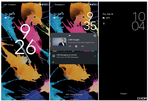
Another change is that in Android 12 you can set which applications can use the media controls in the notification bar. Until now, you just see the application that is playing music, and you have to do with that. With Android 12 you can therefore set that you want to show Spotify and YouTube as media control, but YouTube Music not, for example.
A video that takes place in Picture-in-Picture (ie as a floating window) can now be enlarged and reduced in a different way. You can now use the pinch-to-zoom method for this.
Screenshots
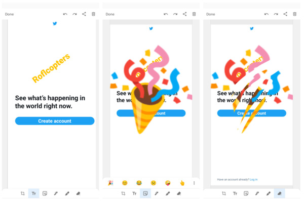
A few things have been improved in the field of taking screenshots. After taking a screenshot you get more options. No longer just a brush, highlighter and manual cropping, but more options. It should all work a little faster and also lets you add text, as well as emoji stickers and an eraser tool, Android Police reports.
The display of a screenshot will also be slightly adjusted, whereby the message can be wiped away immediately. This will also differ per manufacturer. Android 12 also has the ability to take long screenshots, something we have seen for much longer with devices from different manufacturers.
New features
Android 12 offers the option to activate One-Hand Mode. This makes operating a (large) smartphone with one hand a lot easier. We already saw it in recent years at various manufacturers, now also at Google itself.
Also, when using gestures, you can go back from full screen with one swipe. Previously, you had to tap again to open the navigation. In screenshots we also see that the dark theme is no longer dark black, but more very dark blue. It is not known whether Google will add another dark AMOLED theme. In the beginning, the dark theme was for saving battery. With AMOLED screens, the pixels are turned off in black.
If we rely on the information now known, it further becomes possible to hide the punch hole in which the front camera can be found. There are also other improvements; for example, you can press the power button five times in a row for the SOS mode in emergency situations. An emergency call can then be started immediately. You can also snooze a notification at the touch of a button.
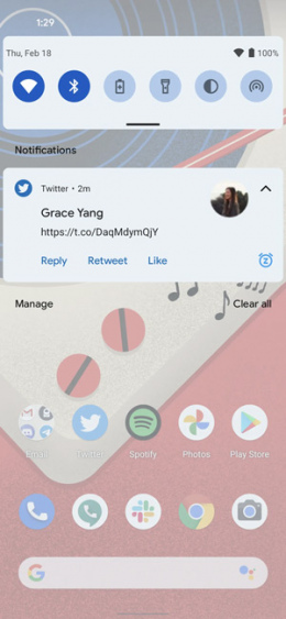
There is more to report about reports. In the Developer Preview 1 there is an option whereby the system can decide for itself whether a sound or vibration should be sent out when a particular app is notified. For example because that is a report that may be important to you. For this, Android 12 will use machine learning. It is possible to make a distinction between important and less important notifications, according to colleagues at 9to5Google.
Settings
The settings window does not seem to have changed, although we see a blue color in the Developer Preview. It seems to us that Google is making that change widely in Android 12, because it looks rather fake. In addition, the settings windows resemble those of Samsung from One UI. Previously, OnePlus with OxygenOS 11 already opted for the same look. The so-called toggle for an activated setting has also been renewed under Android 12 and now provides an additional confirmation (check mark) that a function is enabled.
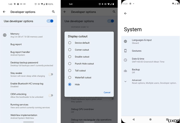
Screenshots via Android Police and XDA
As expected, Android 12 also offers the option to quickly share WiFi passwords with someone else. This can be done via Nearby Share. You can share a WiFi network via the Nearby Share panel. A WiFi password can also be shared just as before via a QR code. There is also an option to filter the intensity of the blue light, making the screen easier to read in low-light situations. Via quick settings it is also possible to immediately block the camera and microphone for all apps.
The colleagues of 9to5Google and Android Authority have made the videos below with the new functions that can be found in Android 12.
Note
We would like to emphasize that these changes and innovations are currently found in Developer Preview 1. This does not mean that the new options will actually all come to the stable version of Android 12. With earlier development versions of Android versions, functions were also removed in the final version. Which position are you most looking forward to?

