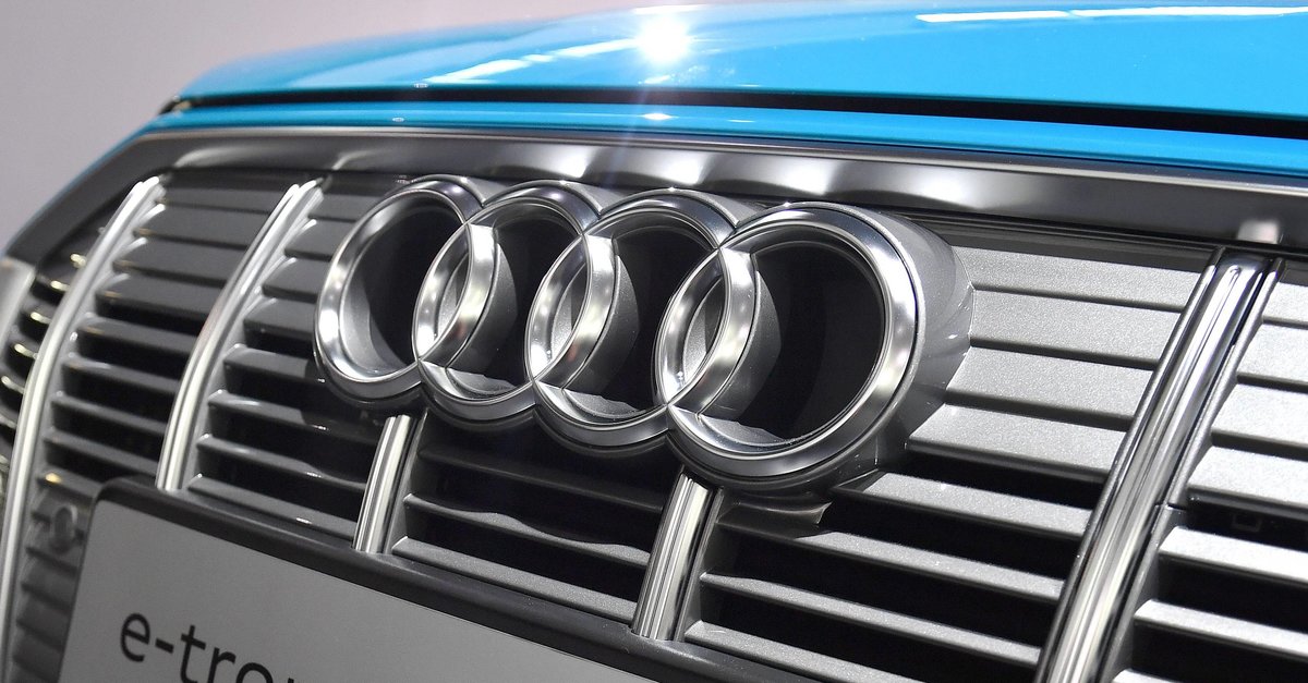
This is what the four rings look like now
Everyone knows the four Audi rings. Nevertheless, the car manufacturer has now decided to update and reinterpret the well-known logo. Chrome is no longer to be found, instead white and a flatter look dominate.
Audi’s logo gets a redesign
When four manufacturers joined forces to form Auto Union in 1932, they were through four rings in the logo of the new company. Nothing has changed about that to this day – and Audi has remained true to the world-renowned company logo even after the redesign.
However, the existing chrome look has now been abandoned and a mixture of white and black will be preferred in the future. The rings themselves are kept light, while the outer and inner borders are dark. According to Audi, this gives the rings a “flat-looking, high-quality impression”. Only on closer inspection should it be noticed that it is a three-dimensional logo. Nothing has changed in terms of proportions.
This is what the new Audi logo looks like:
Digitization is said to be the reason why Audi tackled the redesign. Three-dimensionality on two-dimensional displays would not have met the “technical and aesthetic requirements” (source: Audi). Because of this, the rings are no longer plastic as they were before. The new logo is First seen on the new Audi Q8 E-Tron.
In addition to the refreshed brand logo, Audi also has the Font for model designations customized. In the future, only the in-house “Audi Type” should be used here.
More about the new Audi logo in the video:
Car manufacturers rely on flat designs
have in recent years many automakers changed their logos. Renault, Peugeot, Citroën, Volvo, Dacia, Cadillac and Kia, among others, but also Volkswagen are increasingly opting for flat designs that are less colorful and shiny.

![How data and analytics help businesses [Anzeige]](https://www.basicthinking.de/blog/wp-content/uploads/2023/06/peopleix.jpg)