This is what the first logos of well-known tech brands looked like
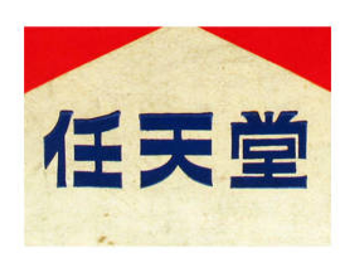
This logo dates back to 1889. (Graphic: Nintendo)
A logo is one of the most well-known recognition marks of a brand. However, many companies have changed their logos over time. In some cases, almost nothing is left of the original idea.
The bitten apple, the fox writhing around the globe or the blue birdie – with these descriptions pretty much everyone will know which brands are being referred to here. Apple, Firefox and Twitter are great examples of how company logos have burned themselves into people’s minds. But the well-known logos did not always look like most people know today. They too have traveled a long way and have changed shape and color several times.
Most companies fare like the three mentioned. If you compare the founding logos with the trademarks used today, often only the name is the same. Especially at companies that can look back on a long history, the logos changed more often than the management level.
We took a look into the dusty logo box in grandma’s attic and restored the most beautiful specimens of bygone days for you. Could you have assigned all the logos to the well-known tech companies?