The new whitehouse.gov not only inspires developers
No time right now?
On Wednesday, Joe Biden was inaugurated as the 46th President of the United States. When it moved into the White House, the associated website also got a new coat of paint.
The White House website was launched in 1994 by the Clinton administration. Its purpose: To serve as a source of information for the public on current President operations. There you can find information about the President and Vice-President and their families. Users can find press releases, proclamations, so-called executive orders and transcripts of speeches given by officials of the White House, about election processes and upcoming elections. Short: wh.gov – how the site can be reached – is an important source of information for the citizens of the USA. The website is extensively revised with every change of president.
Contents
Points of sympathy with developers – and anti-fascists
On the day of the inauguration, numerous developers in the social networks were happy about an Easter egg hidden in the source code of the site: “If you read this, we need your help.”
(Screenshot: t3n)
Shortly after his election victory, Biden had hidden the job offer for web developers in the source code of his transition website buildbackbetter.gov – since Wednesday there has been a redirect to the whitehouse.gov page when clicking the link, but the comment with the request has remained.
However, this is not the only redirect. Anyone who enters antifa.com in the browser bar ends up on whitehouse.gov.
Dark mode and font-size toggle
There’s not too much to complain about with a cursory glance at 1600 Pennsylvania Ave NW, Washington DC. It is noticeable that, in contrast to the Whitehhouse presence of the Trump administration, it has a dark mode. The font size can also be toggled for better readability. In terms of accessibility, however, that’s not all. When opening the Dev-Tools (alt + cmd + i under Google Chrome) is not only the request for cooperation that catches the eye, but also that all images and links are provided with alt tags or link descriptions and Aria labels. There is also a translation into Spanish.
WordPress and jQuery
It is also noticeable that behind the website are apparently WordPress and the JS veteran jQuery. Solid technologies that are still widely used, but in 2021 neither will necessarily be state of the art. Web developer Wes Bos commented on this fact in a humorous allusion to the recently introduced React server components: “PHP is where we are all will arrive in other programming languages at some point. “
PHP is what we will all eventually arrive at in other languages
– Wes Bos (@wesbos) January 20, 2021
However, the web presence of the new US president passed the check with Google’s analysis tool Lighthouse for this very reason – almost without any complaints.
Top marks in terms of accessibility and SEO
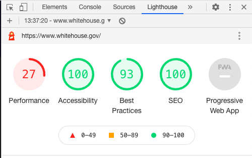
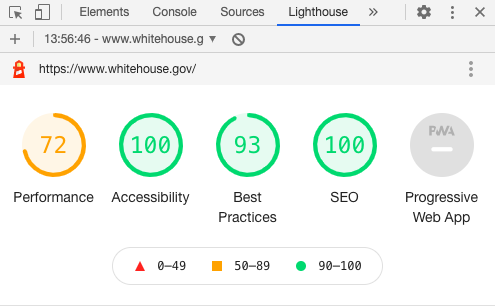
In terms of accessibility and search engine optimization, the site achieved the maximum value of 100 points, and wh.gov is still in the green with 93 points when it comes to implementing best practices. Only in terms of performance did the page disappoint in our test with only 27 points in the mobile view and at least 72 in the desktop view.

(Screenshot: t3n)

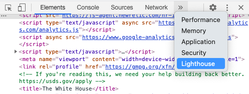
Disclaimer: These values can vary. If you are interested in the details of the score calculation in Lighthouse: You can find the tool with open Dev-Tools (under Chrome) as follows:

(Screenshot: t3n)
And before?
Taking a quick look at one recently (on January 18, 2021) from whitehouse.gov under Biden’s predecessor Donald Trump it becomes clear that there was neither a dark mode nor the font size could be toggled for better readability. Trump’s website also did not offer hidden messages to curious developers who could sniff around in the source code, or a commitment to anti-fascism. However, in contrast to that of his successor, his government had not made the motto “Build Back Better” a priority.


