One design nonsense disappears from the YouTube application for Android
Even small details matter. Specifically for mobile applications that appear on “small” displays, the use of each pixel is absolutely crucial. It is therefore strange when sometimes some designers decide to devote part of the space completely meaningless and also non-functional elementwhich is… no, useless. Even more surprising is the work of Google itself. An illustrative example can be Android Android application, which has so far contained such an element. And as part of the design update by the server, it is gradually no longer included.
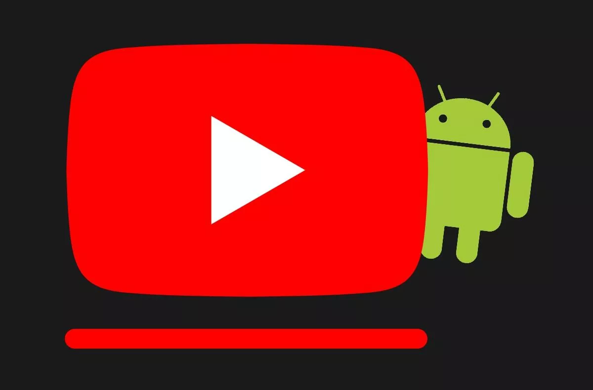
This is a small and short edge line, which is located (even for you just found it) just below the buttons in the bottom menu. The line never had any justification, except that it took up space and created a kind of an artificial barrier between the buttons and possible Android controls, and it could give some users the impression that another menu or menu would open when pulled. Which, as gesture experts in recent Androids know, is nonsense.
-
with line
-
without line
-
dark with line
-
dark without line
However, Google has finally acknowledged that this design element no longer has anything to do in a modern application. As part of the removal of this link, the bottom menu with buttons in YouTube for Android has received one more pleasant improvement. Finally, it matches the color reliably with the rest of the application in terms of setting the dark and light modes.
Have you ever noticed these annoying lines?
Zdroj: apolice