New Gmail app with Material You design rolled out to everyone: is it beautiful?
Google started rolling out a new version of the Gmail app last night. The now famous ‘Material You’ design comes into its own here, but not every user will be happy with it.
Gmail in Material You
In the last days and weeks, more and more applications have been shown, showing the Material You design. At the beginning of this month, we got to see what Gmail for Android would look like in the new design. Now is the time for the new interface to actually be rolled out to users. This results in a new Material You design for the Gmail app on your Android device.
The new changes are immediately visible. For devices with Android 12, the colors of the app will be matched to the colors of the wallpaper. For devices with Android 11 and below, a default blue color is used. This is reflected in the buttons, but also in the labels that are attached to an email. Furthermore, we see the pill-shaped selection of which item has been chosen in the navigation bar. If you want, you can remove the Chat section from the navigation bar, (and here) so that the navigation bar in Gmail is hidden.
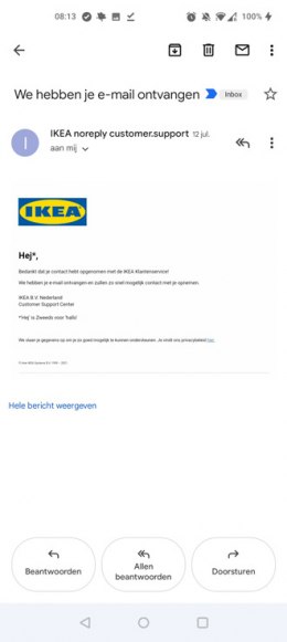
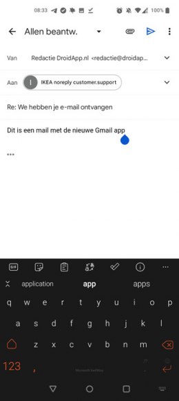
When composing an email, it is noticeable that Gmail for Android has also received a new font. The font is slightly different than it was before. There is no way to go back to the old design. We have already received the necessary signals from users that they do not like the new interface, personally I think it is only a moderate progress, although it may take some getting used to.