Gboard is getting a new design for shortcuts
Google’s keyboard app Gboard will soon get a new design for the shortcuts. In addition, the tablet version of the keyboard app also gets some nice improvements.
Contents
Gboard is getting more Material You
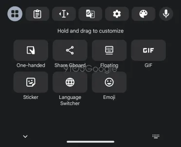
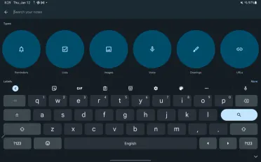
The beta version of Gboard has been put on the operating table, and the doctors at 9to5Google discovered some surprising new capabilities there. Most striking is the new design for the shortcuts that can be found under the three dots. Currently you will find round buttons here. Soon the shortcut will have a rectangular button with rounded corners. This design is more in line with that of the keyboard itself.
Also new is the icon at the top left. This one looks a bit like the old app drawer icon and replaces the arrow. This icon takes over the Material You design. If you tap on it, the other shortcuts will appear.
The Gboard beta also makes a change to the full tablet UI that was introduced in October. Previously, there was a button in the bottom right corner that let you hide Gboard. Google has replaced this button with another ‘?123’ key. You can see the difference in the screenshots below.
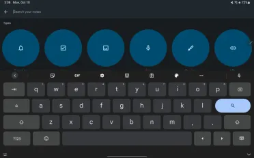
If you miss the previous button, you can always hide the keyboard by tapping elsewhere on the screen. Or swipe back. They’re details, but they can significantly improve Gboard’s user experience. It is not known when Google will make the changes available to everyone. Meanwhile, Gboard is still number one in our list of the best keyboard apps for Android phones.
Which keyboard do you use every day on your phone? Let us know in the comments below this article.
Gboard: The Google keyboard
Gboard: The Google keyboard
Gboard is Google’s official keyboard that was previously only available for Nexus devices. From June 2013 it can be found in the Play Store and can ..
