A lot of room for improvement
No time right now?
With the Polestar 2, the first car with Android Automotive is now available. However, the practical test quickly shows that the German car manufacturers in particular do not (yet) have to worry.
When Google announced that it would offer an infotainment system for the car for the first time with Android Automotive, the reactions from the manufacturers were restrained. Only Polestar (Polestar 2) and Volvo (XC40 Recharge) have so far accepted the experiment. General Motors, PSA (Citroën, Opel, Peugeot, etc.) and Renault-Nissan-Mitsubishi announced in 2018 that they would use Android Automotive in their vehicles from 2021. Little concrete has been heard about this since then.
The advantage of Android Automotive is obvious: car manufacturers such as Volvo, Opel or Peugeot can fall back on an established software platform with a huge ecosystem overnight – and thus save a lot of money in development. In addition, they have a powerful partner at their side in Google. In addition, Android Automotive is designed in such a way that no powerful hardware is required to enable smooth operation of the infotainment system.
In contrast to Android Auto (or Apple Carplay), Android Automotive is a full-fledged and, above all, independent operating system that runs on the vehicle’s hardware. This means that – in contrast to Android Auto – it has access to the vehicle’s sensor data (speed, consumption, state of charge, etc.) and can also control all functions (air conditioning, seat heating, assistants, etc.).
In the Polestar 2, all vehicle functions can be controlled via Android Automotive. (Photo: Frank Feil)
That’s the theory.
Polestar 2: This is how Android Automotive does in practice
The Polestar 2 is the first (and so far only) car on the market that relies on Android Automotive. In principle, you have to imagine the whole thing like an inexpensive Android tablet that was glued to the center console. And exactly here lies the problem.
Android has always had its problems when it comes to UI design and bigger screens. But the Android community loves Google’s mobile operating system for its openness and the resulting (almost limitless) possibilities. But it is precisely this openness that is almost completely lacking in Android Automotive. In the Polestar 2 there are hardly any options for customizing the user interface. Widgets, backgrounds or at least different designs? Nothing. The Play Store is just as bleak. There are a couple of radio, podcast, and streaming apps, plus one for finding a parking space. But that’s it. Anyone who hoped for the variety of the Play Store known from the smartphone will be disappointed.
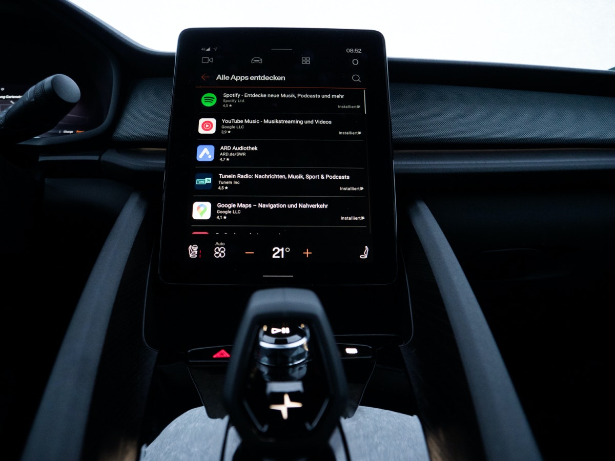
The selection in the Play Store is modest under Android Automotive. (Photo: Frank Feil)
Of course, there is also a reason for this: driving safety. Only apps that meet certain criteria are even activated for Android Automotive. The fact that there isn’t even a weather app, which is itself one of the basics of a five-year-old BMW i3, leaves you a little perplexed.
And then there is the service. As already mentioned, Google Android is not inherently an operating system for vehicles. For this reason, it is problematic when the user interface, which is actually intended for smartphones, is transferred to the car almost unchanged. The Polestar 2 does have a predefined home screen, but it offers little interactivity. On the other hand, if you have Google Maps open for navigation and want to select a different playlist on Spotify, you first have to return to the main screen to open the Spotify app. Just like an Android tablet. With a little practice, it works without any problems while driving, but Android Automotive is still miles away from the intuitive operating concepts currently used in the Mercedes-Benz EQC or Porsche Taycan.
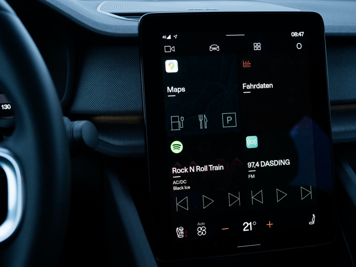
The start screen in Polestar 2. (Photo: Frank Feil)
And then there is the widely acclaimed Google Assistant. In fact, it works perfectly in the Polestar 2 and is clearly superior to the voice assistants of many car manufacturers. But not all of them. If you take “Hey Mercedes” (MBUX) or “Hey Porsche” (Porsche Connect), things look different again. Here the Google Assistant can only score with its extensive knowledge. For this, the occupants have to live with his comparatively unpleasant voice, which was not adapted for Android Automotive.
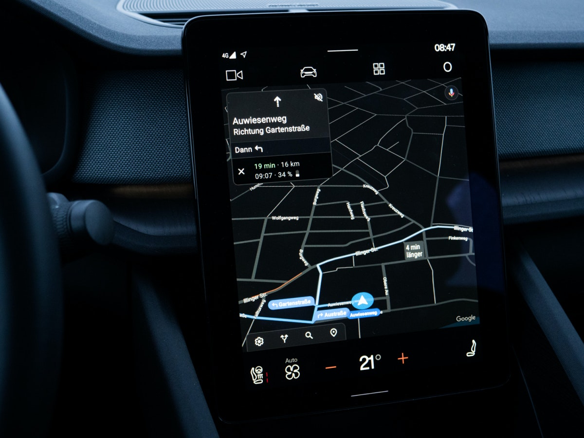
Navigation in the Polestar 2 is done using Google Maps. (Photo: Frank Feil)
Android Automotive may only serve as a basis
After all the criticism, it is important to emphasize that the infotainment system in the Polestar 2 runs absolutely smoothly. Especially when you compare this with the solutions that Volvo uses in models like the XC90 or V60, Android Automotive feels like a quantum leap. But only then.
On closer inspection, Android Automotive shows that there is a lot of potential in the system, but it has hardly been used in the Polestar 2 (so far). Overall, the user interface seems a bit emotionless and far too close to the classic Android look. Except for the somewhat larger operating icons within apps like Spotify, little has been changed. Google Maps reliably brings the driver to their destination, but other manufacturers are already using navigation software that is graphically more sophisticated.
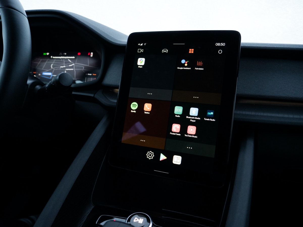
The “Android tablet” on the center console of the Polestar 2. (Photo: Frank Feil)
The second screen behind the steering wheel hardly plays a role for Android Automotive in the Polestar 2. Here you can display Google Maps in full screen mode, but otherwise you have a black screen with some data (speed, charge status, range, etc.) in front of you. More would certainly have been possible, especially when you consider that the Polestar 2 is currently in the premium segment with a starting price of just under 55,000 euros.
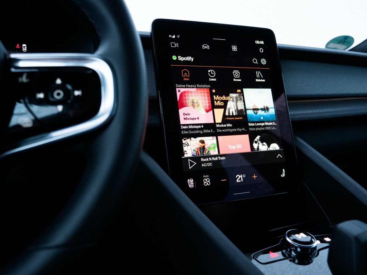
The Spotify app on Android Automotive. What looks chic at first glance doesn’t always turn out to be practical during the journey. (Photo: Frank Feil)
If Google and its partners want to develop Android Automotive into a serious competitor for Daimler, BMW, Audi, Porsche or VW, they have to start thinking in terms of the car category. After all, design and operating concepts that work on the couch at home are only conditionally suitable for interacting with a car while driving.

