You should keep these 5 things in mind
… or with the color spaces. There are two whose abbreviations keep coming up: RGB (R for red, G for green and B for blue) and CMYK (C for cyan, M for magenta, Y for yellow and K for key-color black). And which one do you need now? Digital images and monitors use the RGB color space, but for printing your data must be in the CYMK color space. Since print data is created digitally on the computer, the problem is obvious … and so it happens again and again that the printed products suddenly look completely different than they did on the monitor. Before you hand over the data to the printer, you should definitely convert it to the CMYK color model. How it works? This is where another abbreviation comes into play, namely ICC, which stands for International Color Consortium. So-called ICC profiles are standardized, device-independent file formats and ensure the most constant possible color reproduction on input and output devices, e.g. PC and printer. Depending on the printing unit, there are different ICC profiles that can be downloaded online and then installed on your own computer. Sounds complicated? Admittedly, it’s not that easy either, but stay tuned, there is concrete help at the end of the article.
RGB or CMYK? You can go crazy with all the abbreviations. (Image: stockphoto-graf / Adobe Stock)
… or the different ones Shades of black. Because black is not always black. Instead, there is warm black, cool black, pure black, or deep black. But what is the right black? As is so often the case, that depends. Namely, what should actually (black) be printed. Fine lines or texts should generally have clear edges – in the case of a larger area, on the other hand, it depends on the depth, degree of coverage and saturation, which are only created by a mixture of cyan, magenta, yellow and the black channel K. You can easily use pure black for lines and fonts, i.e. C = 0, M = 0, Y = 0, K = 100. You have to put on the mixed black that you need for larger areas first. There is disagreement about the ratio with which the different color channels have to be mixed. Many print shops recommend an individual mixing ratio with which the best printing results can be achieved on their devices, such as C = 60, M = 40, Y = 40, K = 100 or C = 50, M = 40, Y = 20, K = 100.
Similar to the color spaces, there are also differences in the required resolution between the digital representation on the screen and the finished print products. In general, the resolution of a file is specified in “dots per inch”, or dpi for short. The higher the dot density, i.e. the dpi number, the sharper the final print result. The smaller the motif to be printed, the more likely it is to be viewed from a short distance and therefore requires a high resolution of at least 300 dpi. The print data for stamps, for example, should even be available in 600 dpi. With large-format print products such as posters from DIN A2, you can assume that they will be viewed from greater distances and reduce the dpi numbers to 100 to 150.
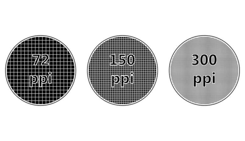
The “dots per inch” or “pixels per inch” describe how high the pixel density is in your print. (Graphic: brovarky / Adobe Stock).
Have you ever had a flyer or brochure printed and even though everything was perfect on the PC, suddenly a few millimeters were missing at the edges? This is not only annoying, but also unnecessary. But that won’t happen to you in the future either, because now you can find out what happens to the so-called Bleed allowance when it comes to pressure. If you want to print a flyer in DIN A5 format, it will end up being 14.8 x 21 cm. However, you have to create your print data with one millimeter more on each side, i.e. in the format 15 x 21.2 cm. This tolerance range is necessary so that no content is missing at the cut edges or white borders arise. The bleed should therefore not be a white border, but rather the same color as the background of the print design.
All well and good, but how and where can you give all this information, you ask yourself? For this you need a program that can be used to create printable PDF files. Probably the best known and most popular program is Adobe InDesign. Suitable for beginners and professionals, flyers, posters, postcards, business cards, brochures and much more can be designed, laid out and converted into printable PDF files with InDesign. Like all Adobe applications, InDesign is quite intuitive to use. Should you still need help, there are plenty Tutorials on all possible topics for beginners: inside and advanced.
Adobe and Flyeralarm will show you
With so many color space abbreviations and cropping specifications you don’t even know where your head is and would you rather see it all in practice instead of just reading about it? Then Adobe and Flyeralarm have just the thing for you! The two have teamed up and launched a joint webinar. Under the motto “Klick.Print.Wow.”, Sven Doelle from Adobe and Stefan Lamb, media designer and freelance trainer, explain everything you need to know to turn your marketing assets, presentations and other screen works into professional print products.
When? The whole thing will take place on November 3, 2021 – from 1 p.m. to 2 p.m.
Who? In addition to Sven Doelle and Stefan Lamb, the two Flyeralarm experts Christoph Glos and Daniel Döll will also be there to support the webinar and to whom you can ask all your questions in the webinar-internal chat.
What? Everything you’ve read here and much more. With practical examples and the opportunity to ask questions.