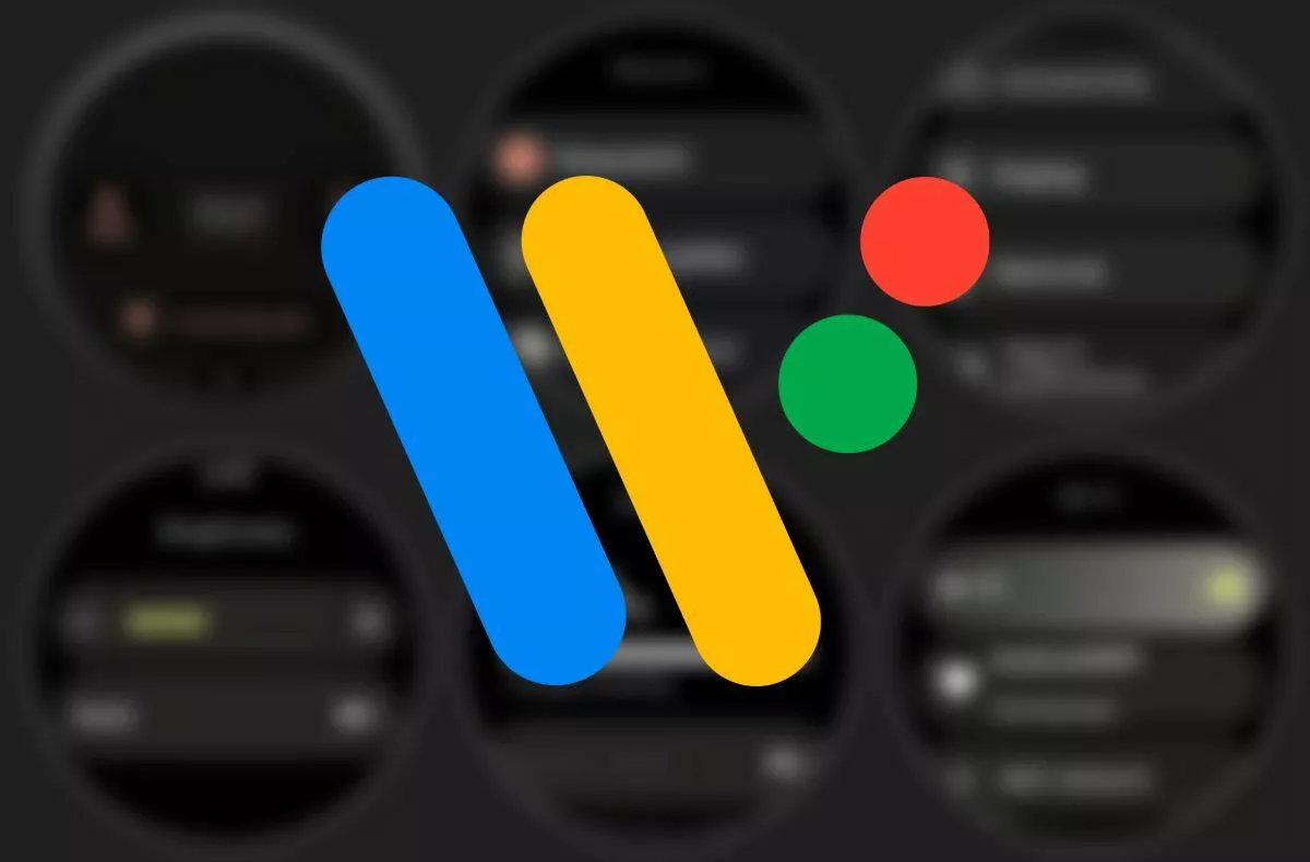
This is what “clean” Wear OS 3 is supposed to look like. What about you?
When the new Samsung Galaxy Watch4 came on the market, they made two first cuts in terms of operating system. Firstly, it is the first watch of this Korean company with the WearOS environment (previously used its own Tizen) and at the same time it is the first version 3 of this Google system. However, in the case of premium Samsung watches, as with the mobile phones of this manufacturer, it is a slightly modified system with a few graphic and functional deviations from what can be called “Pure” Wear OS 3.
So what will this environment look like in its pure form in watches of brands like TicWatch or Fossil, which on unmodified Wear OS have they been betting for years? At first glance, it is especially clear that in this case you will be able to “feel” a new look of Material You. Mainly different color touches. The font is also different and they occasionally appear on the panels gradient transitions between colors. The images are said to have been taken from an Android 11 mobile phone, so the resulting effect of the twelfth version may be even greater in the final.
What do you say about Wear OS in general?
Zdroj: droid-life


