The first look at Android 12 shows a lot of news. How do you like it?
It will be almost a week since Google introduced us to the Android 12 system and many foreign portals brought their first look. Reviewers agree that the system is better, and in most cases they like Material You and the overall redesign of the system.
Contents
Foreign first look at Android 12
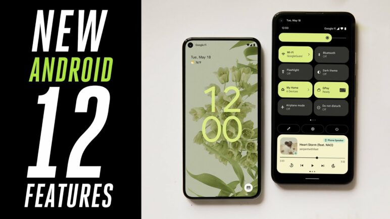
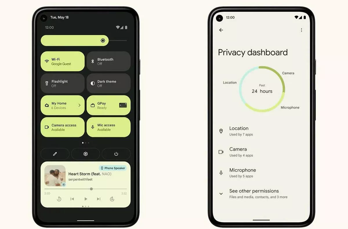
By far the most discussed change is the Material You design language and the system design in general. The notification center has a completely new look and works completely differently than we were used to. Following the example of iOS, we have also seen privacy and security improvements, with an indicator in the upper right corner of the screen that tells you if any of the applications are currently using your microphone, location or camera.
Android 12 Beta 1: Top new features!
Android 12 preview: here’s Google’s radical new design

Android 12 can customize the colors of your wallpaper and then display them on the system. At the same time, it determines which are dominant and which are secondary. There is, of course, much more news. Not only The Verge claims that the system works more smoothly thanks to a larger number of different animations.


