How to transform a client’s needs into a banking application
Until recently, there was a trend in the world of banking applications to get as many products and services into them. Now seems to be the time when applications will adapt to clients as their needs change over time or as their financial literacy increases.
It is not surprising that the player who is changing the perspective of the world of banking applications is again Tatra banka. As a leader in innovation, it has so far set the trend in customer service and has gradually made available to them a number of products and services that they can equip and manage intuitively without the assistance of an employee. However, the banking application is, in essence, still used by most clients primarily as a tool that they still have at hand to perform tasks such as checking the balance of the account or transfer. Although there are clients – and there are not a few of them – who are fully satisfied with the application, there are also those for whom the world of finance is still a bit unknown and needs a different approach.
We talked about what this means in terms of application design Marekom Benches from Tatra banka, which together with its UX design team stands for a dual version of the mobile application Tatra Bank.
Contents
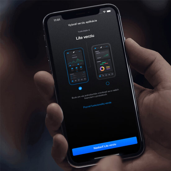
- 1 Tatra banka clients have had some time to choose whether to use the application in its so-called LITE version or in FULL version. To begin with, please tell us what the basic difference between them is.
- 2 What led you to this step?
- 3 So what or according to which key did you decide when designing the LITE version?
- 4 You are the head of the User Experience Design department. What role did your team play in the whole process of developing a new version of the application?
- 5 What does it mean to do the application step by step with the client? This must be quite a difficult process. Can you tell us in a simplified way?
- 6 He mentioned several times that this was a new approach to user logic. What is new in?
- 7 What does the “smooth” conversion you introduced in the LITE version look like?
- 8 At the time we were preparing for this interview, you remembered that the LITE version should, among other things, stimulate financial literacy. What does this mean and what tools or procedures do you want to achieve as a bank?
- 9 What do you plan next for application design? For example, is there anything planned, such as linking the best from the LITE version to the FULL version and vice versa?
Tatra banka clients have had some time to choose whether to use the application in its so-called LITE version or in FULL version. To begin with, please tell us what the basic difference between them is.
The LITE version is, with few exceptions, functionally identical to the full version, which our clients already know intimately. However, it uses simplified logic and new navigation elements that help clients correctly understand the context of banking products and services. It provides easier and more intuitive access to account, card, savings and credit information. It does not currently contain information on supplementary pension savings or investments in TAM funds.
What led you to this step?
Today’s form of the application in the FULL version was created over the years and formed its logic and arrangement gradually. In the case of the LITE version, the situation is different. It was created with the aim of simplifying the environment primarily for new clients and those who, although well versed in the digital environment, but perceive the world of finance more or less only through the basic logic of income and expenditure. I am talking mainly about the younger generation, the millennials and the Z generation. Nobody wants finances to be a scarecrow for them. In short, it could be said that a comprehensive FULL version is ideal for Tatra banka’s regular client with wider product equipment, while the LITE version will help new and young clients gain security in the world of finance thanks to simplified navigation and user logic.
So what or according to which key did you decide when designing the LITE version?
It is simple. The client’s data and opinion spoke clearly. In our department (Experience Design and Research) we often talk to real clients about their experience with Tatra banka. We listen to their experiences and talk to them about the experience that the branch or our digital channels will leave in them. A thorough survey revealed a perception of the complexity of the application Tatra Bank. For a sophisticated client with several products, our application was and still is clearly the best choice on the Slovak market.
This is evidenced not only by the awards received, but also by the positive evaluations in the application years. However, this group does not represent the entire client portfolio of the bank. New clients and the younger generation, who get to know the world of finance through the mobile application, perceived a number of options presented in a concentrated form directly on the application dashboard for “Slightly scary”. (smile)
You are the head of the User Experience Design department. What role did your team play in the whole process of developing a new version of the application?
Our task was to provide just the User Experience that our team has in its name. The initial survey, which formed the methodological basis of the entire project, was from our workshop. In practice, this means that we have tried to transfer the client’s opinion and expectations as much as possible to every screen, to every graph, to every function or button. Our designers worked for several months on the survey, interpretation of its results and their transformation into the final design of the screens and the so-called flow.
The biggest challenges were the way of switching versions and also the design of the questionnaire, which recommends a specific version to clients based on their needs. An interesting challenge was also the “Home” screen, which contains a new navigation and completely digs through the logic of the original mobile application. Our work is beautiful and creative, and thanks to great cooperation with developers, we are the first bank in the world to have a skin or, in other words, a dual version of a mobile banking application.
What does it mean to do the application step by step with the client? This must be quite a difficult process. Can you tell us in a simplified way?
This is a great question. First of all, it is necessary to listen to the client and forget about the ideas about banking, which could limit us. That’s the only way we can really listen. The rest is about hard work, communication with product managers, with developers. After each step of the design process, we and our clients underwent comprehensive testing to make sure that each client’s expectations had been heard as much as possible before entering each phase.
In an environment where so many variables change, listening and dialogue with the client, data and constant market research are the only way to keep up with the times and growing demands of clients.
He mentioned several times that this was a new approach to user logic. What is new in?
Most see this new approach in the new section Bank. In it, we categorize products into clear and clearly interpreted units. These help clients realize the impact of a particular product on personal financial health or their own balance sheet. We divided the entire product portfolio into five parts – accounts, savings, loans, insurance and investments.
The last two named groups are currently not included in the LITE version. Such a breakdown helps to see the products clearly, easily and in relation to other products. Thanks to conversations with users, we know this was the right move.
What does the “smooth” conversion you introduced in the LITE version look like?
Smooth transfer? I will tell someone how much and send the payment. That is all. Clients like the simplicity. And that simplicity is in the right place in this case, because bank transfer is one of the most common reasons to sign up for a mobile application.
At the time we were preparing for this interview, you remembered that the LITE version should, among other things, stimulate financial literacy. What does this mean and what tools or procedures do you want to achieve as a bank?
Many people, especially those born earlier, take finance as a boring and intimidating topic. Easy orientation and navigation help eliminate that deterrent effect. Attractive visuals and modern controls make a topic such as money more interesting. In the future, however, we are preparing several other innovations that will make it easier to get acquainted with the financial world… but I will not say anything about it for now. You have to wait 🙂
What do you plan next for application design? For example, is there anything planned, such as linking the best from the LITE version to the FULL version and vice versa?
We are currently monitoring the behavior of users of both versions, identifying strengths and weaknesses. However, every next step will be based on the data and needs of clients. We have more than enough plans and work. Creating the perfect client experience is a never-ending process.
Thank you for the interview.
Mobile application Tatra Bank | Tatra Bank