Google releases new logo for Google Chrome
The Chrome browser has been around since 2008. In recent years, the logo has been revised several times, and now it is clear that it is time for another new logo.
Google Chrome with new logo
The latest version of Chrome Canary, an early test version of Chrome, includes the new logos that Google will use for future versions of Chrome. The logo was last overhauled in 2014, adding more accents and some depth.
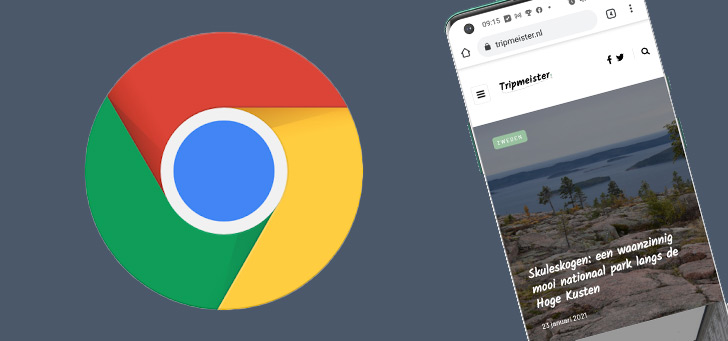
So now it’s time for a new logo as well. The whole idea is the same, only there is more saturation in the colors, and the blue circle is just a stroke big. The shadows have been removed to bring it more in line with the rest of the Google branding.

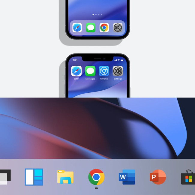
The whole itself remains immediately recognizable as a Chrome icon, although that is not the case on every platform. The icon will not look the same on every platform. For example, the iPhone (iOS) version will have a blue design, because it is more in line with the appearance of Apple apps for developers.


