Google is giving places in search results a Material You makeover
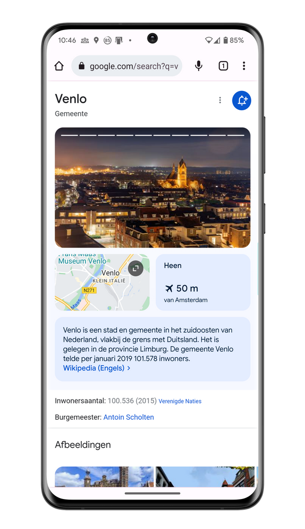
Now, when you google a place name, you’ll be welcomed by an uncluttered Material You view consisting of multiple boxes of information. It looks like this.
Updated place information in Google Search
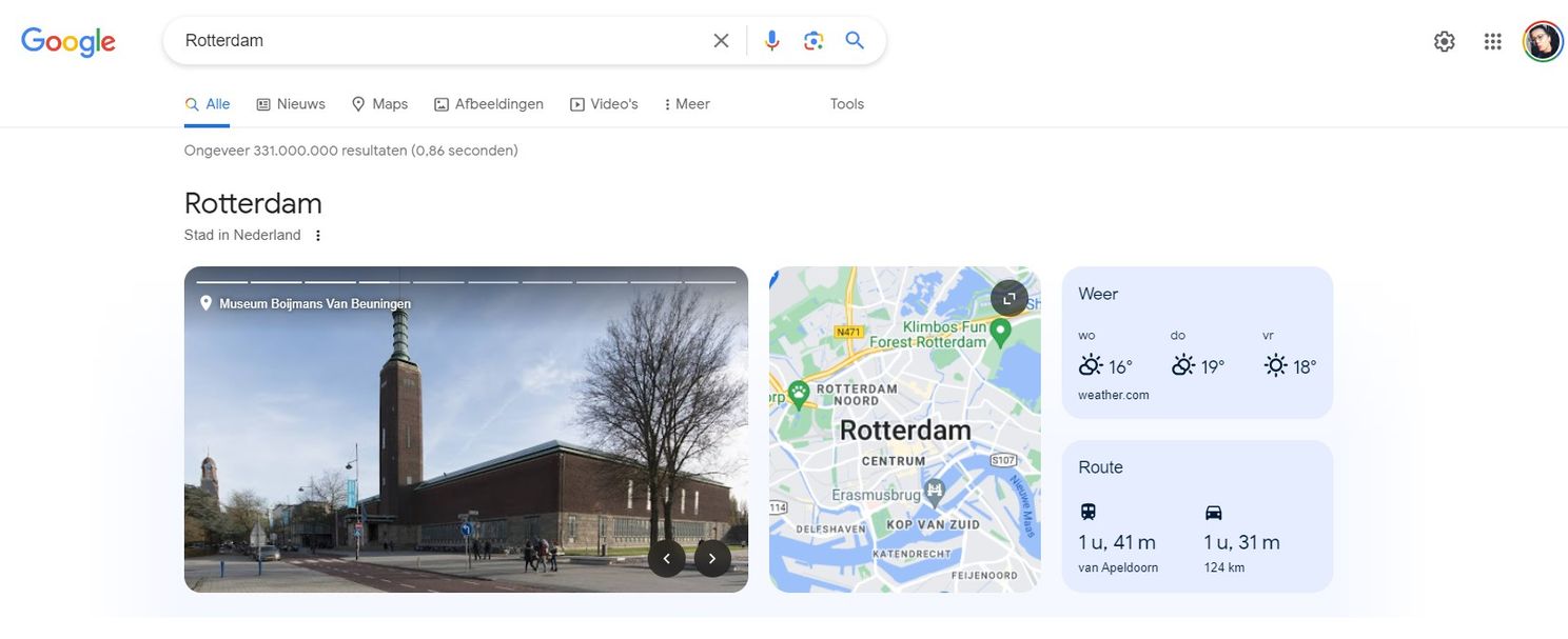
Google has given the search results of places in Google a modern Material Your look. If you google the always beautiful Venlo, you will see different types of information in four boxes below and next to each other. At the top you will see a carousel with different photos of the place you searched. Below that you see boxes with the location on Google Maps, the current weather at that place and the route there via various means of transport. Finally, there is a piece of information about the place from Wikipedia.

The new design can also be seen on desktop if you search for a place name. Only there the boxes are displayed horizontally with the Wikipedia information in to the side, just next to the other search results.
Do you already see the new Material You design in the search results of a city in your browser? Let us know in the comments.
What is Material You?
Google introduced Material You with Android 12 as a new interface in Android that is all about the user. Material You builds on the well-known Material Design, but with a focus on personalization and individuality. Material You allows users to customize the visual elements of their Android experience based on their own preferences and style. Using colors, shapes and fonts, interfaces are transformed to suit each user’s personal taste. The goal of Material You is to create a more personalized user experience.

New display of Google search results on desktop


