Customers will have to change soon
Sparkasse has refreshed online banking on the desktop and in the app and made it more uniform. It should be available to all Sparkasse customers by the end of the year. According to their own numbers, the new look is well received.
Sparkasse: online banking in a new design
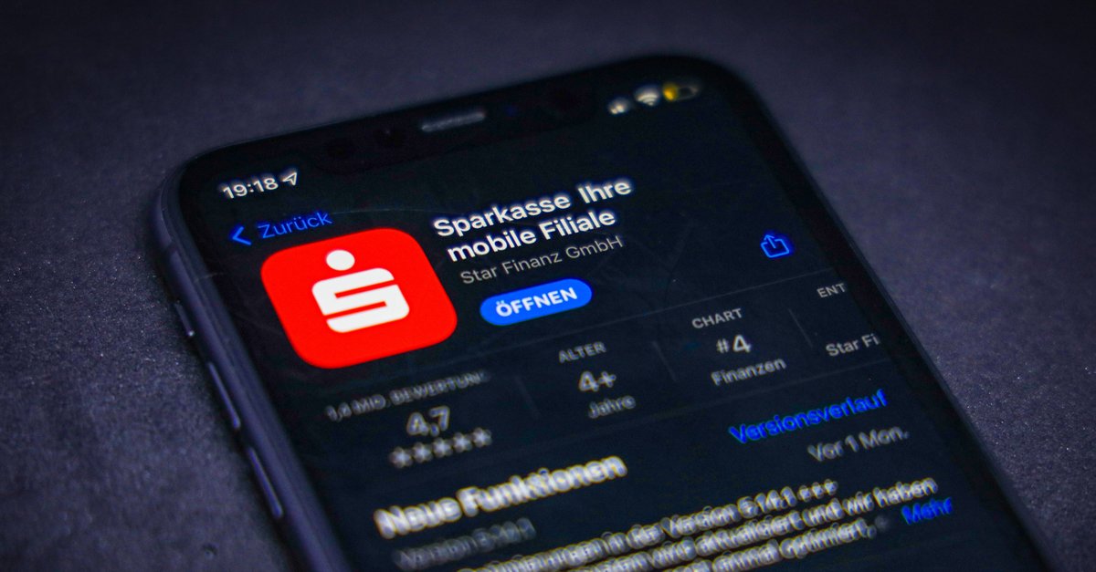
In March, Sparkasse reorganized its mobile app and gave it a new coat of paint. The design is now also available on the desktop for many customers. According to figures published now, already see 1.9 million customers the new online banking on their computer. The refreshed design should have arrived at all savings banks by the end of the year.
The aim of the new look is for more clarity and provide easier navigation. The most frequently used functions should be able to be found more quickly, and the previous top navigation has been dispensed with. According to the Sparkasse, sales are presented in a clearer and better structured manner. The chaos with the settings should finally come to an end, instead everyone can be found in one place.
To the needs of all generations to take into account, we worked together with UX specialists. Font sizes and line spacing have been optimized, and click and touch areas have been made more spacious. Differences between the mobile variant and the desktop website have largely disappeared. Financial management, multi-banking and transfer templates are available on the go as well as on the computer.
How to stay on the safe side with online banking:
Sparkasse: New online banking is well received
According to Sparkasse, customers like the new design. Almost 80 percent of the account holders surveyed agree with the new look “good” to “excellent”. Support requests for operation after the introduction also fell sharply (source: Springer professional).


