Google Calendar and Google Drive get new Material You design
A new server-side update is rolling out for the Google Calendar and Google Drive apps. The biggest change; the Material You design.
Drive and Agenda in Material You
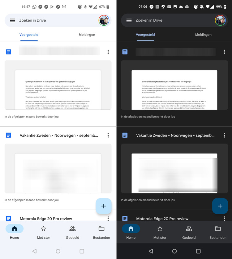
Once again, a number of Google apps have been given a new look. This time it’s the Google Calendar and Google Drive apps. Both apps will now receive a server-side update in which the new design from Android 12 is applied.
You don’t need to have Android 12 to see the new Material You design. There are currently no devices that run on the final version of Android 12. If you use the beta, however, you can already see more than users under previous Android versions. The colors will then be adjusted to those of your background.

The Material You design is characterized by the new shapes. In the calendar app we see this by the plus icon for creating a new item. The changes are also noticeable in the side menu and some icons have also been adjusted. With Google Drive for Android it stands out with, for example, the navigation bar, where the pill-shaped immediately stand out, together with the square shapes that are partly rounded. The same applies to the search function, where the search bar is cast in a different color.
Users will see the new interface appear automatically in the Google Calendar and Google Drive app.


