this is how you make it better
Not often have we had such a major update for Android as with Android 12. It mainly offers significant visual adjustments and that is noticeable. However, that does not mean that there are also some things that could be improved. Sometimes the choices developers make aren’t such a good idea after all. With these tips you can iron out those mistakes with ease.
Contents
1. The giant lock screen clock
Like the clock at home is ticking, it’s not ticking anywhere, but like the giga clock is ticking on the lock screen, it shouldn’t be ticking anywhere. Perhaps the idea is that you can also see what time it is on the other side of the room, so that you don’t have to look too conspicuous in a meeting, but rather the clock is a bit smaller.
Unfortunately this is not possible by selecting ‘small’ somewhere. You have to use a lifehack, which is to ensure that there is always an active notification on your screen. That way you get to see a smaller clock. For example, use a weather app (such as Appy Weather, Today Weather, or the app Randomly RemindMe, because they send notifications very regularly.
2. It’s not so much Material You after all
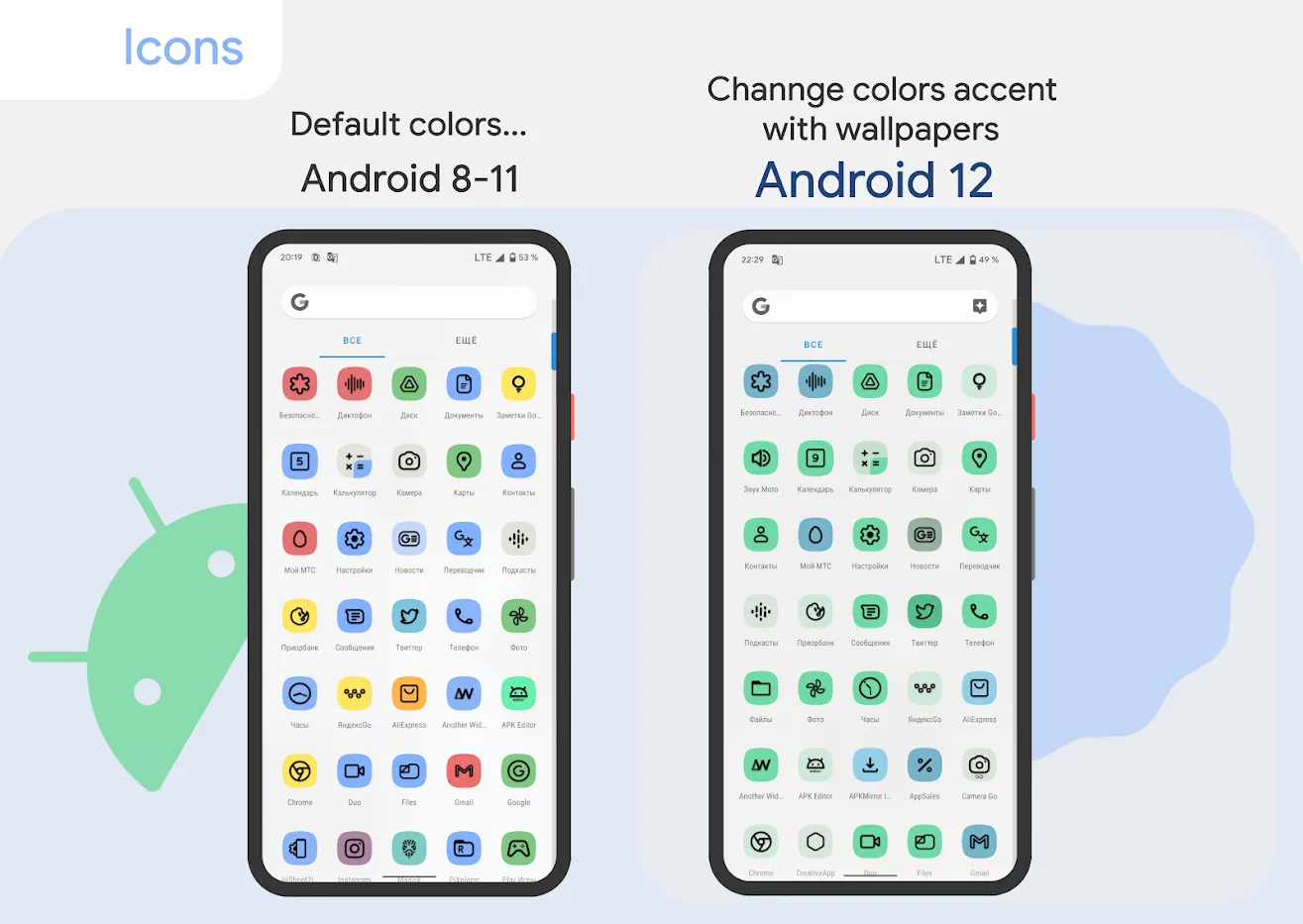
Material You works like a train: if you use Pixel with fairly standard settings, you will notice that it does indeed let everything color beautifully with the background of your device. It’s a feast for the eyes, were it not for the fact that it doesn’t change everything so nicely if you use a launcher other than Google’s. The icons for example. You can easily solve this by downloading the Pix Material You Icons app from the Play Store, because with this you can place icons on any device that automatically change with the theme you have set.
3. The slightly slower Quick Settings
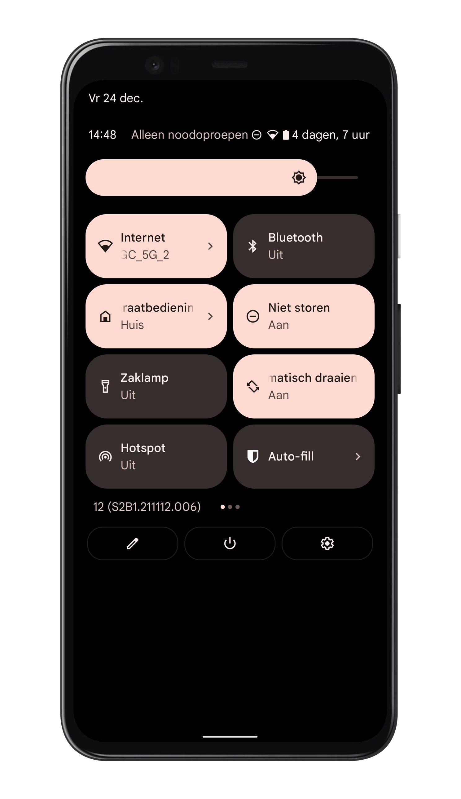
If you quickly swipe down from the top of your smartphone in Android 11, you will see the Quick Settings: this is a kind of summary of different settings that you can also find in the settings menu. Often they are commonly used options, such as Bluetooth, Wi-Fi and Airplane mode.
In Android 11, the Quick Settings still consisted of small balls, so that six options fit next to each other. Now there are only two next to each other and four Quick Settings take up a little more space than the six dots it used to be. That suddenly feels a lot slower! You can do something about this by replacing the Android 12 Quick Settings with your own alternative. You can use an app for this called Power Shade and this is how you proceed:
- Open up Power Shade.
- Go to ‘Layout’ in the menu
- Choose the ‘Number of header tiles’ and set the ‘Tiles grid’
- Go back to your screen, swipe down and you’ll see more tiles than a few minutes before
4. It is much less easy to adjust the volume
It’s not entirely new, but that doesn’t make it any less annoying. Adjusting your media volume to normal when you touch your device’s physical volume buttons. If you prefer your volume buttons to adjust your ringtone, instead of your media sound, this can be arranged. All you have to do is download the Volume Styles app, which will help you bring back the standard Android volume menu that is customizable however you want. Look at ‘Slider types’ under the ‘Customize’ button and put ‘Ring Volume’ at the top. Don’t forget to press OK to save your choice, scroll up and tap the big start button. You still have to give the app access and then you are completely baked in terms of volume.
5. Get rid of the Google Assistant
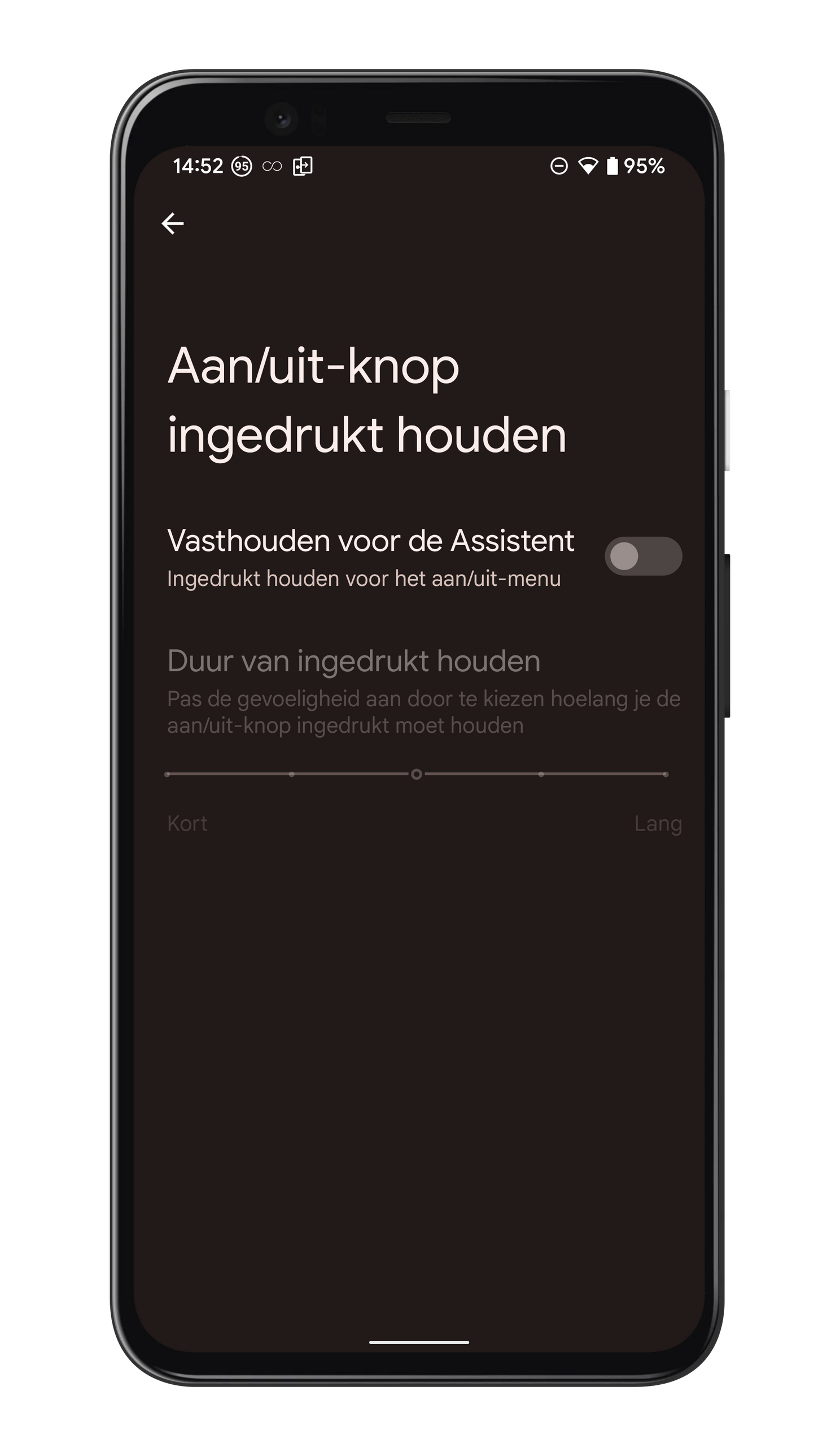
The Google Assistant is very useful, but sometimes she’s an unwelcome guest. For example, when you long-press the power button on the Pixel 6 or Pixel 6 Pro. Often this happens by accident when it has just been shoved in your pocket. That’s already very annoying, but what’s especially annoying is when you just want to call up your on/off menu. For this you have to press both the power button and the volume button, something OnePlus users do, for example, to take a screenshot. If you don’t think that’s such a success, you can find a setting on a Google Android 12 phone to prevent this. Go to Settings > System > Gestures and then press ‘Press and hold the power button’. On the screen that follows you need to turn off the toggle for the ‘Hold for the Assistant’ and then it will be back to how it should be.
Google has officially announced Android 12, but when will your phone get the update? We have made an overview of the phones that get Android 12. Would you like to learn more about Android 12? Be sure to check the articles below.

