Nothing Phone (1) review: solid newcomer with LED back
If you want to have a chance on the smartphone market as a new manufacturer, the device must have something extra, for example a low price compared to the competition or have one or more unique features. The latter applies to the Nothing Phone (1). You can read in our review whether this is enough to conquer a place in the already crowded smartphone market.
Contents
Nothing Phone 1 review
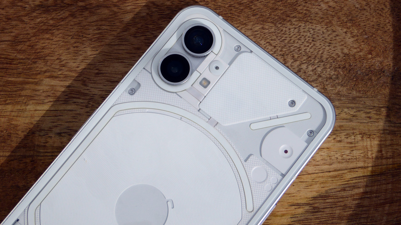
With the Nothing Phone (1), Nothing brings an excellent midranger on the market with a unique feature: the LED lighting on the back of the device, glyph interface as the manufacturer calls it. We have extensively tested for you whether this really adds anything to the device. We’ll update you in the Nothing Phone 1 review.
Sales package
The Nothing Phone (1) comes in a square, rather thin box. On the top of the box we see an image of a part of the back of the device. You open the box on the side. From here you can slide the phone and the USB-C cable out of the box. Unfortunately, a charger is not included.
Design and interface
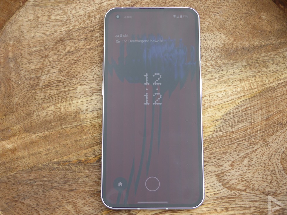
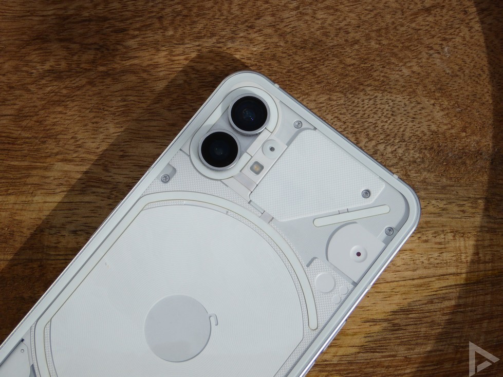
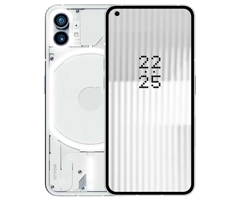
At first glance, the Nothing Phone (1) resembles an iPhone in terms of design. Until you turn the phone over. The back is transparent and here you can see the lighting, the glyph interface. In the top left corner is the camera module with the 50 megapixel main camera and the also 50 megapixel wide-angle lens.
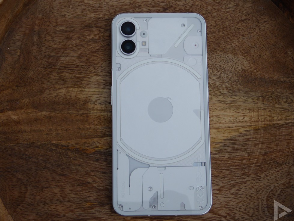
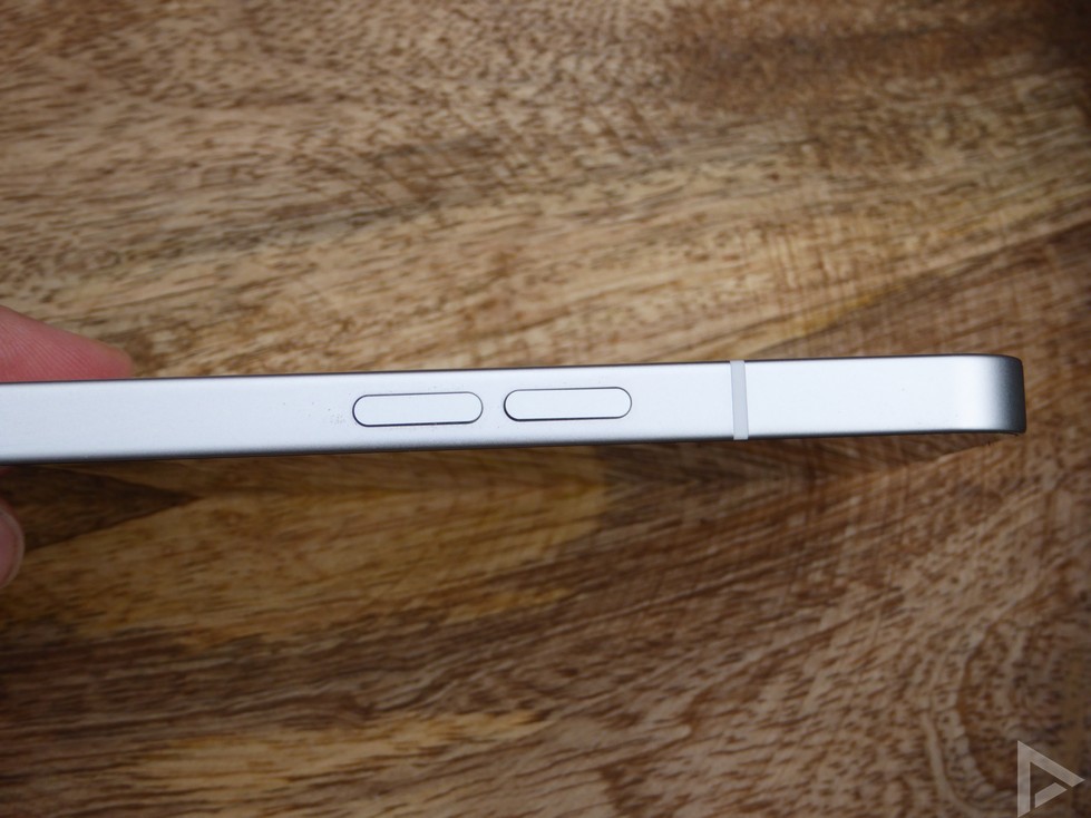
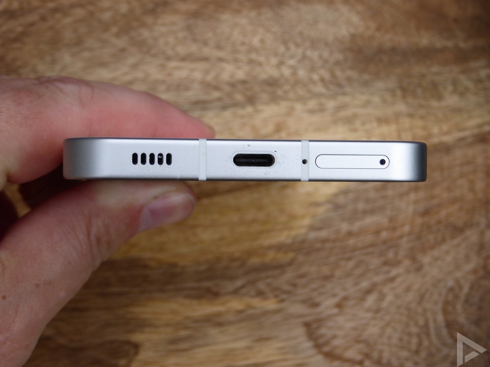
The bottom offers space for the USB-C connection, the SIM tray and one of the two stereo speakers. The second is placed at the top of the 6.55-inch screen. This screen is a Full-HD OLED panel and is of excellent quality and also has a refresh rate of 120 Hz. It is easy to read on a sunny day and can be dimmed sufficiently in the dark. The selfie camera is placed in the top left corner and the fingerprint scanner is placed below the screen. The scanner performs its task quickly and accurately. On the right, Nothing has placed the on and off button. The volume buttons are located on the left.
Interface
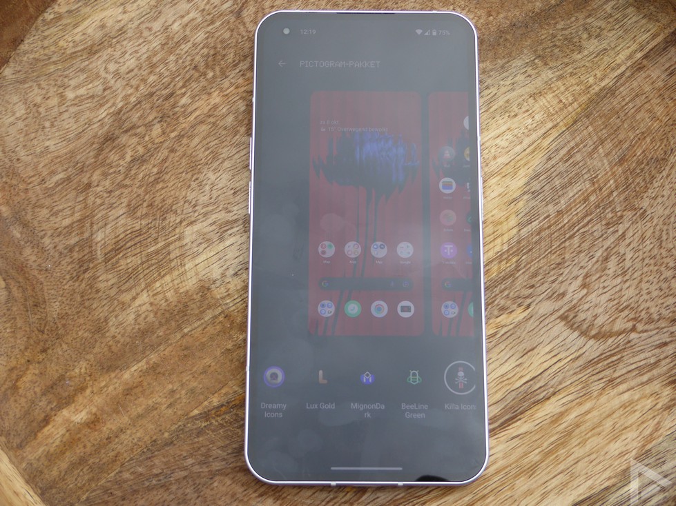
Nothing has not tinkered much with the standard Android interface. We think that’s a plus. The manufacturer has added some options to customize the glyph interface to your liking. This gives you the option of having the lighting on the back flash in a certain preset rhythm. The phone vibrates to the same rhythm. This may not sound very exciting or useful, but once you get used to the glyph interface it is very useful. Typically such a function that you miss when you switch to a device without lighting on the back.
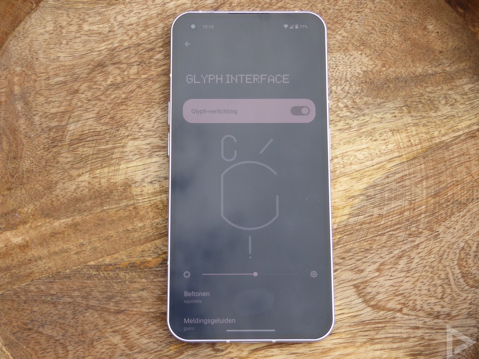
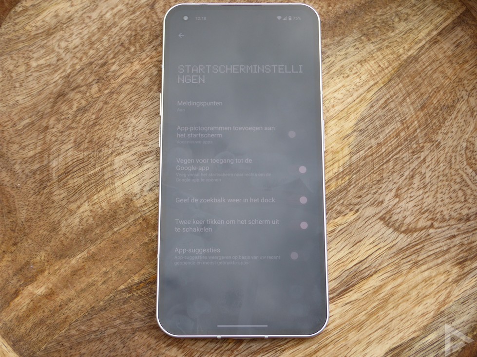
An experimental option has also been added to connect to your Tesla. Due to the lack of a Tesla, we were unable to test this option. You can completely customize the start screen to your own taste. It even supports icon packs that you can download from the Play Store.
Communication: calling, surfing the internet and networking
Of course you can call, surf the internet and send messages with the Nothing Phone (1). The apps you use for this are the standard apps from Google. As we can expect from a midrange smartphone, the device has 5G, WiFi, Bluetooth 5.2. GPS and NFC. The device can accept two SIM cards, but there is no space for an SD card.
We’ve talked about it for a while, the glyph interface. When you receive a notification or receive a call, the LEDs on the back of the device will flash. Depending on the selected ringtone or notification sound, the backlight flashes. When you have a notification and you lift the phone, the lighting also flashes, so you immediately know that you have a notification. A small downside is that the lighting cannot be dimmed and is therefore quite bright in the dark.
Multimedia: music and film
The Nothing Phone (1) is a great smartphone to watch videos and listen to music. The stereo speakers are of excellent quality, as is the screen. A small downside is that operating the volume takes some large steps. The screen is also fine as we mentioned earlier. You can also set the screen to your own wishes in terms of colors. You can choose between 60 Hz and 120 Hz for the refresh rate.
Camera: photo and video
The Nothing Phone (1) has to make do with two cameras on the back of the device and one on the front. The two cameras on the back both have 50 megapixels, the selfie camera 16 megapixels.
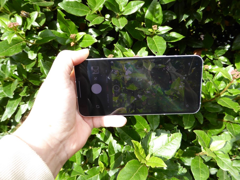
The camera app is pleasant to use. For a mid-ranger, the rest of the photos are pretty nice. Photos have a good drawing with a lot of details, but when the lighting conditions are not ideal, they are sometimes on the dark side. We also note that sometimes parts of photos are moved faster and that they are sometimes a bit grainy. Below is an example photo that we shot with the Nothing Phone 1. If you want to see more photos, you can visit our digital photo album.

Selfie camera and video camera
The selfie camera performs the same as the cameras on the back of the device: with sufficient light, the photos are fine, but with less light the quality is a bit disappointing. Unfortunately. The Nothing Phone 1 can also film well. You can watch a video we shot with the device below.
Performance: battery, speed and memory
Nothing has equipped the device with the Snapdragon 778G+ processor. Although this is not a high-end processor, tasks are handled smoothly and without stuttering. This in combination with the working memory of 8 GB. This is more than enough for the average user. The 256 GB storage memory (a 128 GB variant is also available) is also more than adequate for the average user.
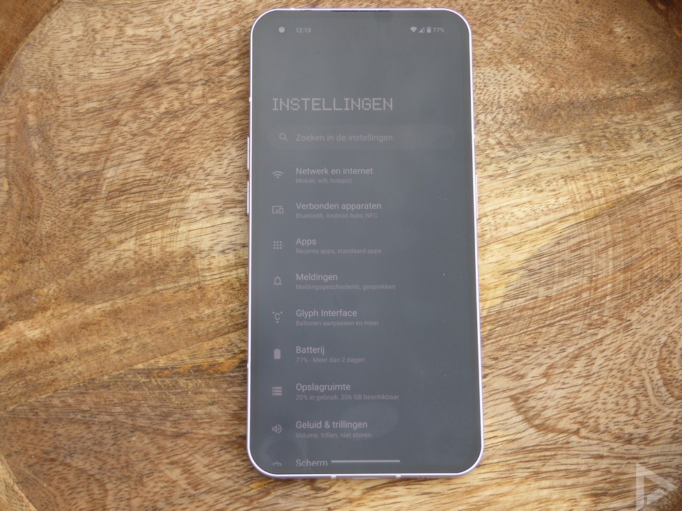
The battery is 4500 mAh in size. This is not the largest, but with intensive use you will get through the day. With a screen-on time of more than 4 hours, you have about 25 percent left at the end of the day. The Nothing Phone (1) can be charged with 33 Watts, but you will have to buy the charger separately.
Update Policy
Not much is known about Nothing’s update policy yet, so this will have to prove itself in practice. The manufacturer will support the Nothing Phone (1) for three years, with four years of security updates. A neat update policy. Android 13 will (only) be rolled out in the first half of 2023, and it is not known whether this will be at the beginning, or, for example, only in May.
Rating
We are very pleased with the Nothing Phone (1). The only downside is the camera, which could use some improvements. Hopefully this will be fixed by software updates. Another minor flaw is the lack of a charger in the package.
In addition to these negatives, we are therefore positive about this newcomer. The processor, memory and battery are all quite sufficient for most users. The glyph interface is a nice addition to the Nothing Phone 1, which we will certainly miss on other devices.
You can buy the Nothing Phone 1 at: Amazon and Belsimpel.
Check out our dedicated product page for more news, specifications and prices.
-
Design and ease of use – 9/10 -
camera – 8/10 -
Speed and performance – 8.5/10 -
Battery and Charging – 8.5/10 -
Value for money – 8.8/10
8.6/10
Rating
Pros
- Glyph interface
- nice screen
- Excellent value for money
- Sound stereo speakers
Negatives
