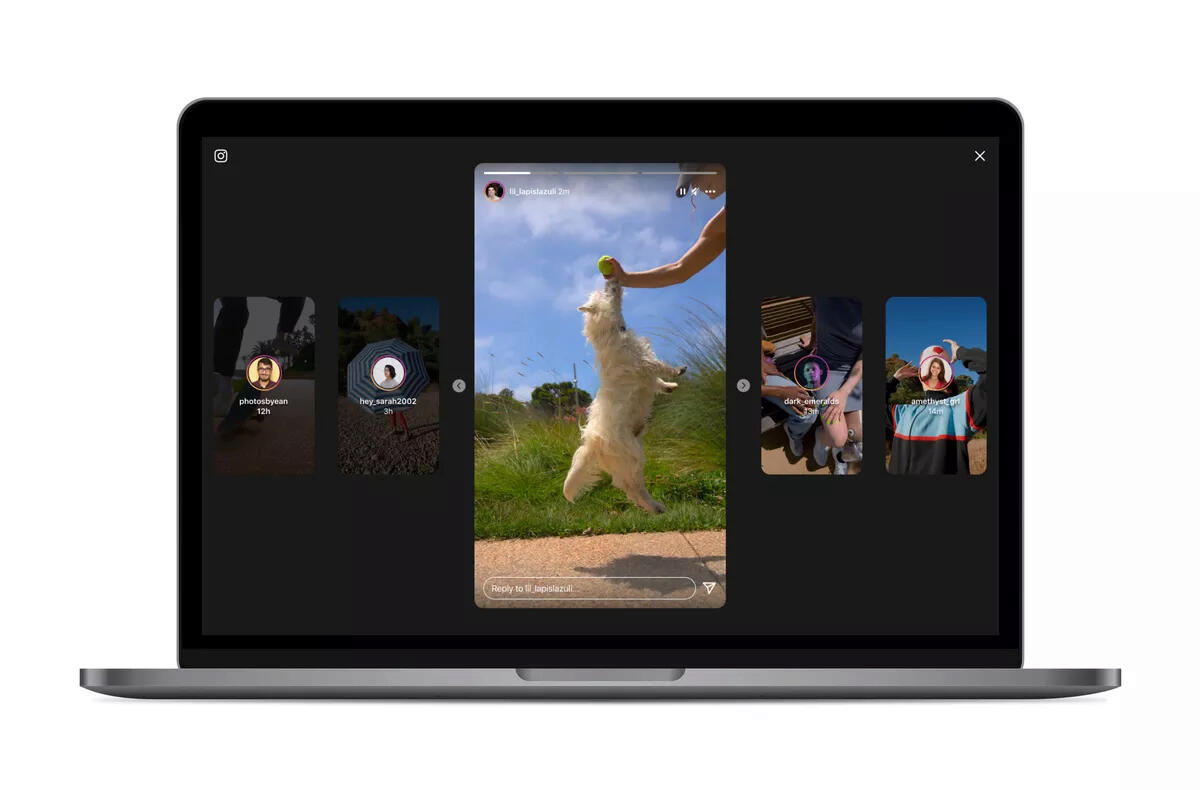
New look Instagram stories, the first step to redesign in the browser?
Instagram users have been complaining about the appearance of stories and entire social networks in the browser for years. But the platform did nothing with the inaccessible design in the browser. Until now. Instagram has apparently listened to user requests after years and redesigned the appearance of stories. The new design is clear, minimalist a uses the entire area of your screen. In addition, the new look of Instagram stories in the browser will offer easy skipping of forward and backward stories and easier display of profiles when viewing stories.
The question remains why Instagram redesigned the appearance of stories only after such a time. Are they trying to catch users outside of Android and iOS who spend most of their time on the computer? The previous design definitely attracted several potential users. We will see for ourselves how the new look of Instagram stories in the browser catches among users. The element that employs the attention of the social network outside of Instagram stories are the so-called Reels.

Reels are short videoswhich appear on the phone in the bottom bar. Instagram Reels are direct competitor TikToku, but in the browser version of Reels we do not see on the main page, only on user profiles. So it is possible that redesign stories is the first change to better display Instagram in the browser, which may be followed by a change in the appearance and location of Reels.


