Amazon Prime Video gets a new design, these are the first images
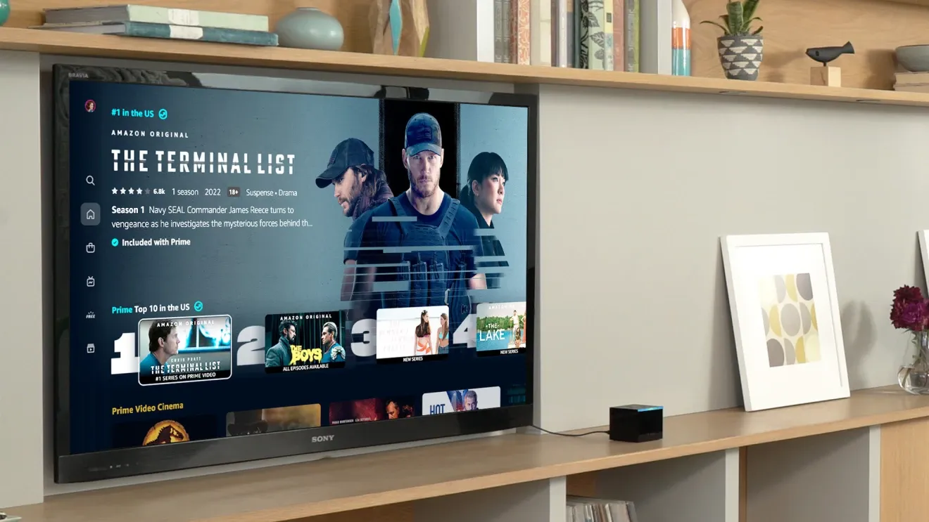
Amazon is currently working on a new look for its apps for Android phones and tablets, as well as for smart TVs, Apple TV, Android TV, Roku, consoles, and its own Fire TV streaming device. Thanks to the new design, it should be easy for Amazon to put certain films and series in the spotlight. It should be easier for subscribers to find new content. These are the first images of the new interface for Amazon Prime Video.
Amazon Prime Video
Prime Video is a streaming service that provides Prime members with a permanent collection of movies and TV shows – all with the convenience of finding everything in one place..
More info
![]()
Amazon Prime Video will look different soon
Do you have a subscription to Amazon Prime Video? Then you can expect a new interface of the app on your Android phone or tablet. Amazon Prime Video on your Android TV device also gets a lick of paint. According to Amazon, the app will get six improvements, which you can find below. Not only do these improvements make the app look a lot clearer, it will also look more like the Netflix app. And that’s not a bad thing, because most people already know that interface and that makes the switch to a new Prime Video interface less complicated.
- A more user-friendly navigation menu
- An easy way to watch live and scheduled sports
- A faster way to find the shows you want
- Clearly marked content
- More beautiful images in carousels
- Find your favorites—or something completely new

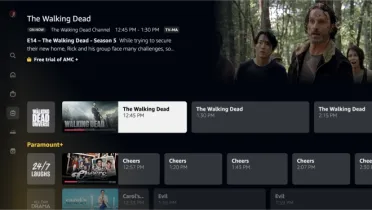
Thanks to the new side menu, you no longer have to scroll through the many old menus. The buttons Search, Home, Shop, Live TV, Free and My stuff can easily be found in this bar on the left. The main menu is further divided into movies, TV shows, and sports, while the store page has special sections for renting Prime Video titles.
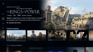
The interface also clearly shows what content is available for your Prime membership, rather than what is for sale. Those titles have a blue check mark on the home screen. Titles to be rented or purchased will instead have a gold shopping bag icon.
There are also new carousels with a nicer visual representation of titles without making them seem crowded. The Search page has also been simplified and allows customers to search for a specific title or explore different genres. Search suggestions are shown in real time as you type, and you can easily filter results by genre or 4K UHD.
The new Amazon Prime Video interface will be available to customers this summer. It is not known when exactly. Have you seen the new interface yet? Let us know in the comments when and what and what you think.


