Two new features will greatly improve the bottom panel of the Gmail application
If you haven’t used a version of Gmail a few months old, you’ve probably noticed that Google has opted in to us force a new bottom menu. And in addition to the Mail item, there are also Chat, Places and Meetings buttons, which are the result of implementing new tools directly into the mail client. If you like this bottom panel completely annoying and you do not use anything from its menu, it can deactivate it by turning off the mentioned items. We wrote an example for Meetings shortly after the introduction of this menu. However, Google did two nice news for users who still use something from this menu.
For owners of Pixel phones with Android 12 (it is not yet clear if this is a condition), this bottom panel has started to appear in the first place without labels for individual buttons. The developers probably assume that users are already used to the meaning of the icons. In any case, the elimination of tests saves a few pixels and the menu is lower. The second novelty is even better.

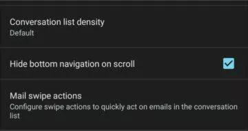
A radio button has appeared in Gmail settings automatic hiding of the panel during scrolling. This is a very useful option if you need the bottom menu from time to time, but it usually binds you more. At the moment, it seems that both news are distributed from the server and therefore the version of the application does not matter.
How much (not) do you use this bottom panel?
Zdroj: droid-life


