Nothing Phone (1) in the test: Better than expected
The Nothing Phone (1) is the first smartphone from OnePlus co-founder Carl Pei. I was skeptical whether this cell phone would convince me in everyday life. The hype about it recently deterred me rather than excited me. In the end, Nothing’s debut was a success. And the glyph lighting hardly played a role in that.
Contents
Nothing Phone (1) in the test: conclusion
GIGA rating: 7.6/10
Overall, the Nothing Phone (1) convinced me. I particularly like the design, build quality, battery life and software – although there are still a lot of little things that need to be improved in the software. The glyph lighting is really cool to show off, otherwise it’s more of a gimmick in my opinion. I prefer the always-on display.
There really isn’t much to criticize about the Nothing Phone (1). The many small software problems just have to be solved. Perhaps the company will also manage to improve the image quality of the cameras a bit. Otherwise, I was pleasantly surprised by the smartphone overall. It is a solid mid-range phone with a few special features. I’m very excited to see what else Nothing is planning.
Advantages:
- design
- performance
- software
- Wireless charging function
- IP53 certification
- Update Guarantee
Disadvantages:
- Lots of small software bugs
- No power adapter included
Brief history
Nothing is a fairly new company built by OnePlus co-founder Carl Pei. OnePlus was integrated into Oppo for this and continues to build smartphones. Nothing initially started with the Ear (1) in-ear headphones and followed up with a smartphone with the Phone (1). More products may appear in the future. In the video you can see the first impression of Frank.
Strong iPhone vibes
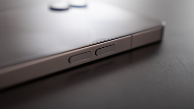
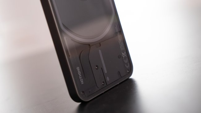
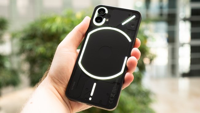
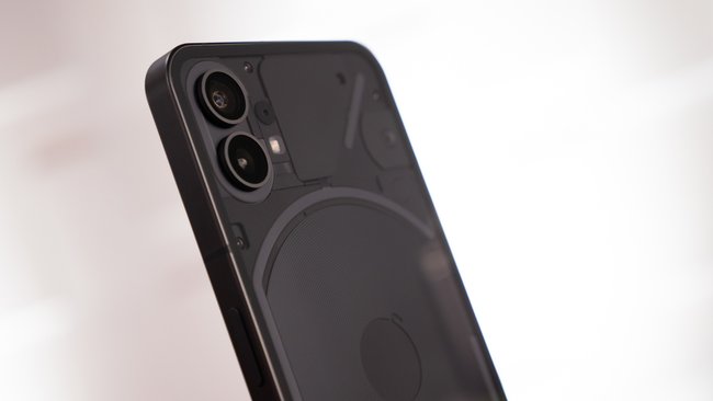
The design of the Nothing Phone (1) is something special. The basic form with the Frame is very reminiscent of an iPhone, which is not bad, because the rest is self-contained. The transparent back with the glyph lighting is particularly eye-catching. At the front, the frame around the 6.55-inch OLED screen is quite wide, but it is absolutely even. Many manufacturers of Android phones can’t do that. Then the chin is always a bit wide, which disturbs the aesthetics. Everything is nicely symmetrical here.
The Nothing Phone (1) lies in the hand just like an iPhone. It feels relatively light for the size though. Even if I welcome that on the one hand, a little more weight would have given a higher quality impression. Basically I am satisfied with the quality of the smartphone. I haven’t noticed any issues being discussed online. But our black version is a real fingerprint magnet.
Eye-catching design
The combination of the iPhone frame and the transparent back causes a stir. With the white version certainly more than the black version that we have, where you have to look closely. I also used the smartphone without a case because it is quite secure in my hand. I would not have thought that at first sight.
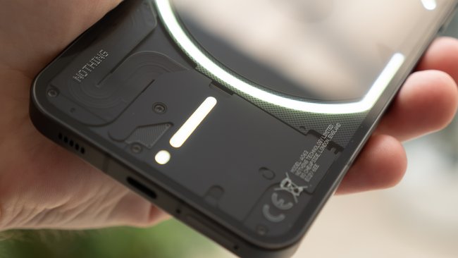
the Glyph lighting is quite nice as a gimmick, but nothing more. Why should I put my phone on the display and basically learn morse code to know who is calling me while I can just turn on the always-on display and it says who is calling or texting me. Certainly nice as additional LED lighting when filming, otherwise rather superfluous in my opinion.
But I also understand why Nothing did it. It’s a real unique selling proposition, with which one got into a conversation, and certainly very cool for demonstrating in front of friends. But I haven’t actively used it and I can’t imagine that many people do that. In addition, the always-on display is much more practical. But I appreciate the transparent back. I’m a big fan of that.
Display could be brighter
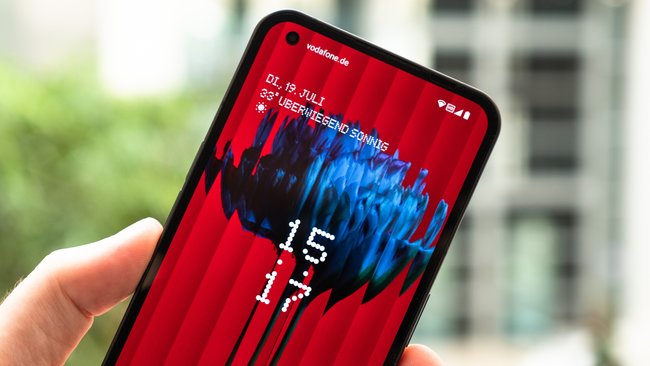
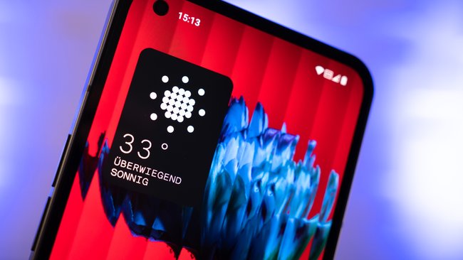
The OLED display of the Nothing Phone (1) measures 6.55 inches and has a FHD+ resolution. The brightness indicates Nothing with up to 700 nits. That’s absolutely fine, falling just short of a Galaxy A53 that maxes out at 800 nits. Still I would have me especially now in the summer a slightly brighter display is desired. However, the applied protective film could also be a reason for the reduced readability, because it reflects quite strongly.
The display works at a maximum of 120 Hz, which the user cannot set as a fixed value, but can only use an automatic function. On the whole, it works relatively reliably. From time to time, however, I noticed in the Chrome browser on Twitter that the refresh rate drops for no reason and scrolling is no longer so smooth. I think this can still be fixed in software. Basically, I think the display is okay for the price range.
The fingerprint sensor sits under the display and works optically. I think this is far too low. I have this problem with many cheap smartphones. However, the fingerprint sensor works quickly and reliably. This is a small benefit after testing the Pixel 6a, where the fingerprint sensor works rather moderately. If the sensor in the Nothing phone were two centimeters higher, it would be perfect.
A curiosity struck me while riding my bike. I had the Nothing Phone (1) in my trouser pocket and sweated a bit while doing sports. That was enough for the smartphone in the trouser pocket to simply activate and accept the wrong PIN countless times. Actually, the display in the trouser pocket is switched off by the proximity sensor recognizing that the cell phone is in the pocket. Of course, it could also have gone wrong if the emergency call was alerted in the trouser pocket and I don’t even get it. That also needs to be fixed.
Performance is okay
A Snapdragon 778G+ works in the Nothing Phone (1), which is supported by 12 GB of RAM and 256 GB of internal storage in our test device. In this case, nothing more is possible. I think the performance of the cell phone is very good in most cases. This is probably also due to the fact that only small things have been adjusted in the “Nothing OS” interface so that performance is not negatively affected. Otherwise there is pure Android 12. The operating system, apps and everything else actually runs smoothly.
But it also comes every now and then that stutters appear. It’s not really bothersome now, but you’ll notice it over time. There are also some image distortions when the display is rotated. Nothing still has to work on that. It does, because there have already been updates. There is also an update guarantee of three new Android versions and four years of security updates. Less than Samsung or Google, but more than many other smartphone manufacturers.
Pure Android with pixel graphics
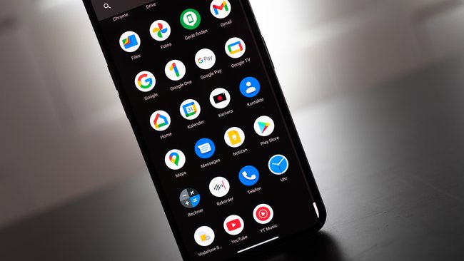
I personally am one big fan of the pixel graphics and text, which uses Nothing in the Phone (1). Be it the charging animation when the smartphone is switched off and charging, or the always-on display. The pixel font is just a nerd’s dream. Otherwise, as already mentioned, you get almost pure Android with smaller additions such as setting the glyph lighting.
However, the operating system is not perfect, because it bothers me, for example, that when I use the Change accent color, this is not adopted everywhere. So I still have a different accent color in the app drawer than in the quick settings. For example, when I go to the settings, the color changes very briefly to the correct accent color and the menu opens. There are a few little things like that. Again, I’m sure Nothing will fix all of this over time.
Otherwise the operating system works for me. It’s pure Android with little extra features and the pixel font. Nothing didn’t do too much here, but also didn’t do too little. The many small errors must of course be corrected over time. In any case, we will keep an eye on that.
Camera weakens in the dark
As long as there is enough light, the Nothing Phone’s (1) main camera works quite well. The autofocus is fast, the colors look natural and not oversaturated, and the shutter lag is okay. I liked taking pictures with the main camera. The wide angle, on the other hand, is rather weak in the same lighting conditions. You can clearly see the qualitative difference. Something was saved on the sensor here. At night it gets a little more difficult. If you can hold the phone steady, then the photos with the main sensor will be decent too. However, the shutter lag is a bit too high. The Pixel 6a (test) is superior. Below are some snapshots I took with the Nothing Phone (1):
Battery life is convincing
The Nothing Phone (1) has a 4,500 mAh battery that me always got through the day. The efficiency of the smartphone with the always-on display activated and 120 Hz is impressive. Even with intensive use, I didn’t have to recharge during a normal day. If I used the cell phone less, then it was enough for two days. That’s great.
However, I noticed that in A relatively large amount of energy is consumed in stand-by mode. I fully charged the smartphone for test purposes and just left it there for 24 hours. It didn’t actually do anything during that time, apart from synchronizing, of course, and then it lost 34 percent of its battery power. That seems a bit much to me for a smartphone that does nothing. Of course, this can also be fixed with an update. Other cell phones don’t use as much energy when they’re idle.
Although the Nothing Phone (1) is in the middle class at 469 euros, it can be charged wirelessly. This is a big advantage compared to the competition. I’ve set up wireless charging stations everywhere and I’m always annoyed when I test cheap cell phones that can only be charged with a cable. Luckily that’s not the case here.
ratings in detail
| category | Rating (max. 10) |
| sustainability | 7 |
| Processing, haptics and design | 8th |
| screen | 7 |
| cameras | 7 |
| software | 8th |
| performance | 9 |
| telephony and audio | 7 |
| Storage | 7 |
| Battery and everyday life | 9 |
| In total | 7.6 |
Note: The “Sustainability” category counts for 10 percent of the overall grade.
