This is glass morphism and that’s why it looks familiar to you
No time right now?
A new design trend is born. It combines many best practices and of course does not reinvent the wheel. Rather, the glass morphism further develops approaches from the past in a meaningful way.
Which designer doesn’t remember new morphism? The 2020 design trend tried to redefine the boundary between abstract and real design. He only partially succeeded in doing this.
Contents
Neumorphism – predecessor and catalyst of glass morphism
The starting point of the new morphism was the map-based design. This has become popular with Google’s material design conventions. It is characterized by a very geometric design method that collects content – regardless of whether it is text or media – in individual cards on a homogeneous background. The cards look as if they are floating above the background. Otherwise they are designed completely flat.
Neumorphism: Here the obvious problems can already be guessed well. (Design: Danascript)
Designers were now looking for a method to bring this abstract type of representation back a little closer to reality. They believed they had found them in the new skeuomorphism, also known as “New Skeuomorphism”.
Instead of the floating maps and other UI elements, all elements should now be created from a single solid material along with the background. UI elements are embossed into or out of the material. This creates a homogeneous user interface that still appears well structured.
The fact that elements can be worked out of the material, but also worked into it, gives designers the opportunity to create interaction. This is easily done in that one status can be linked to one and the other to pronounced.
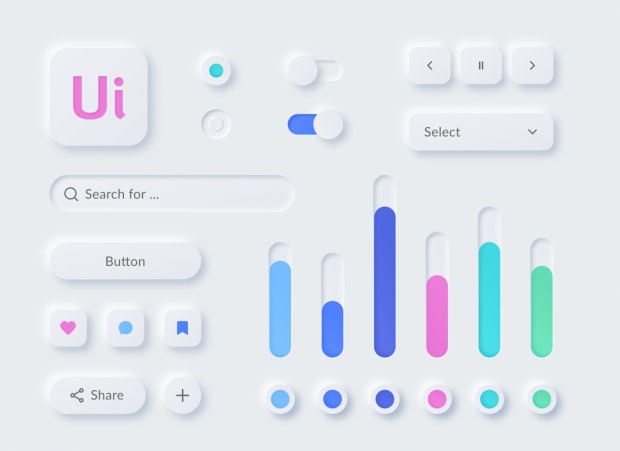
UI kit in new morphism. (Designer: Tatsiana Charnysh / Dribbble)
This can look very fancy and work well for a variety of uses. But there is one serious catch. Because we connect the elements to one another on a surface, they are no longer free-flowing.
So we come back to a monolithic design, which is a no-go, especially when it comes to accessibility. This can be mitigated by clever UI design, but it quickly reaches its limits. Now, of course, we could – as before – force certain neumorphic layouts, for example using breakpoints. But do we want to go back there?
That is glass morphism
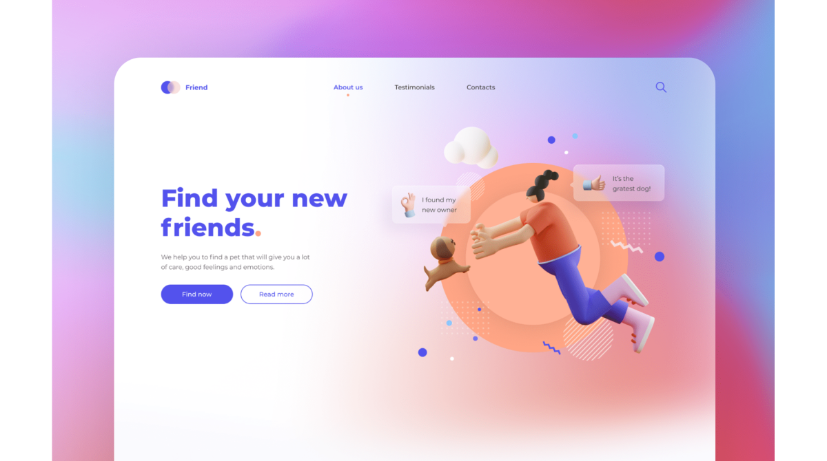
This is where the new trend of glass morphism comes in. With glass morphism, we use the card-based design in its purest form as a starting point. With the maps floating above the surface, we retain sovereignty over the representation of the design, even in fluid designs.
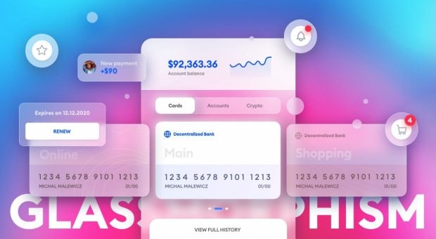
Intentionally excessive use of technology at the UX Collective. (Source: Michal Malewicz)
In order to achieve a modern look, that is, the glass look, we put a partially transparent blur on the entire surface of the cards. With rounded edges and a few pixels thick outline, we can create the impression of a glass edge.
This creates the impression of floating glass panes over a background that is as brightly colored as possible, but also very blurred. A room can be created by varying the transparency setting of several virtual glass surfaces. Surfaces with higher transparency appear closer to the viewer than those with lower transparency.
Clear color gradients are important as a background. They also reinforce the spatial impression. Very strong colors are the trend. Light shadows under the elements can be beneficial if the background does not stand out clearly enough.
The glass optics can be light or dark. We then put light surfaces on dark backgrounds, dark surfaces on light backgrounds. So we can set up a dark mode for our design relatively easily.
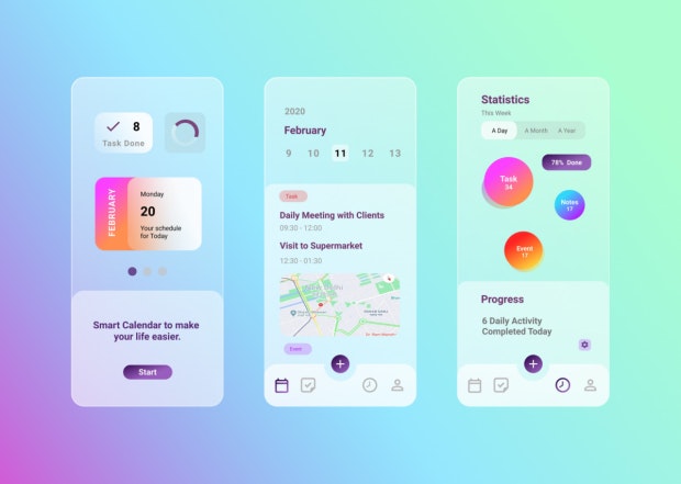
Calendar UI in Glassmorphism. (Designer: Arpit Tyagi / Dribbble)
Apple and Microsoft are making broad use of the effect
Examples of these types of backgrounds can be found in abundance in the new macOS Big Sur. Apple has also implemented the partially transparent look of floating UI elements in the latest version of its operating system.
Apple is neither the inventor of the trend nor the first to use it. For once, Microsoft was faster here. The look of brushed glass surfaces has long been part of the in-house Fluent design system. Microsoft does not speak of glass morphism, however, but calls the design method Acrylic.
Users should like the look not least because it evokes associations with current premium smartphones. Brushed, i.e. matt glass surfaces are simply in. So why not benefit from them?
Glass Morphism Resources
You can find a very detailed description of the design trend from the colleagues from UX Collective. Like Dribbble over 2,000 suggestions by colleagues ready. Of course, they’re not all good.

Glassmorphism CSS Generator. (Screenshot: t3n)
You can find one at the designers of the agency Hype4 Glassmorphism CSS generator, which offers you a live preview and lets you play with blurring and transparency using the slider. Anyone who wants to try out CSS implementation on foot should the corresponding technical article by designer Albert Walicki.
The designers at the Romanian design company Themesberg have a suitable one Glassmorphism UI kit announced. However, this is not yet available at the time this article is published.
Last but not least, you can find it on Youtube quite a few tutorials on Glassmorphism, especially concrete instructions on how to implement the effect with Figma, for example. Do you work with Adobe Xd you should this video look at.
Have fun experimenting!