New interface for the mobile version of Google Search
In time for the new year, Google is updating the design of the Google search for its mobile version. The design adapts to existing designs of other Google products. Google has already published images of the new design.
Google designer Aileen Cheng was faced with a difficult task with the design update. Millions of people use Google’s search engine every day. The functions and features have become more and more diverse and complex over the years. So every change must be carefully considered. Cheng’s task was to adapt the design to already established UI’s in Android and other Google products.
The new version
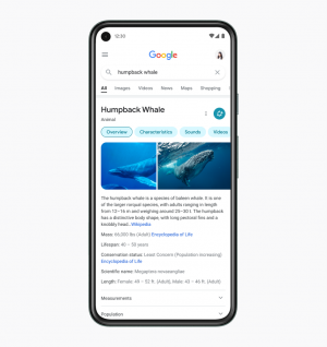
In the new version of the user interface, Google has given up the previously blue-gray background area in which the basic data of a search object and a menu were displayed. This design was based on the principle of “cards”, which should keep the results clear and organized than in previous versions.
The menu now appears a bit more compact and is replaced by light blue buttons in Google’s example (Overview – Characteristics). New features also seem to have played a role in the creation of the design, because “Overview” and “Videos” may have been in the button before, but “Characteristics” and “Sounds” were at least on the first one Search results page not yet visible. In addition, there is now more space under the button than before for a preview of the term from Wikipedia.
In its announcement, Google highlighted the readability. The tech company made this improvement with a bigger font and bolder letters. The new font is now Google Sans. Google now wants to use this font consistently on Android and many other Google products.
“Googley” replaces “Cards”
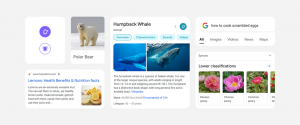
The new interface replaces the principle of “cards”, which should summarize every result clearly. The button was previously embedded in this card. From now on, occupy this entire width of the page.
Overall, Google tried to establish a “Googley feeling”. The buttons should be “bubble” -like and “bouncy”. A design that Google has already implemented in many of its other products. The update will take place in the next few days, as Google stated. The tech giant did not provide any information as to whether the update would reach all users at the same time or whether it would be sorted by country or other criteria.
![These are the best deals [Anzeige]](https://www.basicthinking.de/blog/wp-content/uploads/2023/04/smarte-gartenhelfer-tink-smart-home.png)