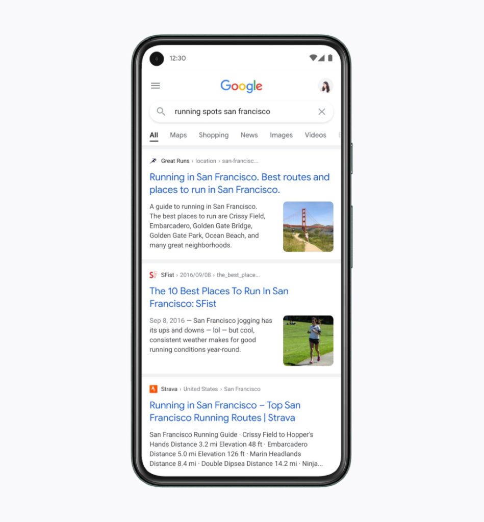
Google’s mobile interface gets a new design
Looks like even Google is keen to do something new for this new year. Based on information from TechCrunch, the search giant has redesigned the look of its main interface and more precisely, the way search results are displayed on your mobile.
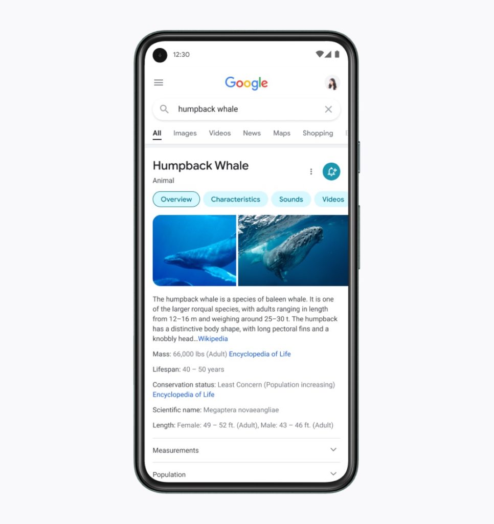
While these changes aren’t revolutionary, they still help make Google’s mobile interface more pleasing to the eye and easier to read for internet users. The reason for this is that these changes effectively provide a more streamlined browsing experience for Internet users, with more readable text, sharper contrasts, easier to find information, and rounded frames that improve the overall display of search results.
Simplify and optimize the user experience
As the designer in charge of this new Google design, Aileen Cheng, explains, one of the goals of the technology firm is to “ simplify the experience and lead users to the information they are looking for as clearly and quickly as possible “. In other words, Google wants to optimize as much as possible the time that Internet users spend on its search engine and allow them to quickly identify the information they are looking for.
To do this, Google does not skimp on the formatting of the texts. The search giant, for example, made the font bolder and larger, especially for the titles of the pages it shows in search results. Likewise, it makes more use of its Google Sans font to harmonize the user experience. For information, we already find this Google font in various company products such as Gmail.
A more airy display that highlights important information
In addition, to facilitate Internet users’ access to information, Google has also relied on ventilation and contrasts. According to Aileen Cheng, “ this allows more visual space and breathing zones so that search results and other content take center stage “.
The contrasts thus serve to quickly draw the attention of Internet users to important information. Another change to note, Google now uses more maps, buttons, icons and rounded images to recall the curved lines of the Google logo.
The deployment is gradual, it should appear in the coming days.