Google starts spreading new web design for Play Store
The Google Play Store website looks different for different users. It was about time, because the design of the web version of the Google Play Store was somewhat outdated. What will the new design bring?
New web design for Play Store
The web version of the Google Play Store is getting a major makeover. The first screenshots of the new design have now surfaced, because some users can already see the new design. The design is reminiscent of an enlarged version of the Google Play Store app as you can already find it on your smartphone. This means a lot of white space, larger images and a bit more overview. The search bar has been replaced by a magnifying glass, which you can find in the top right corner of the website.
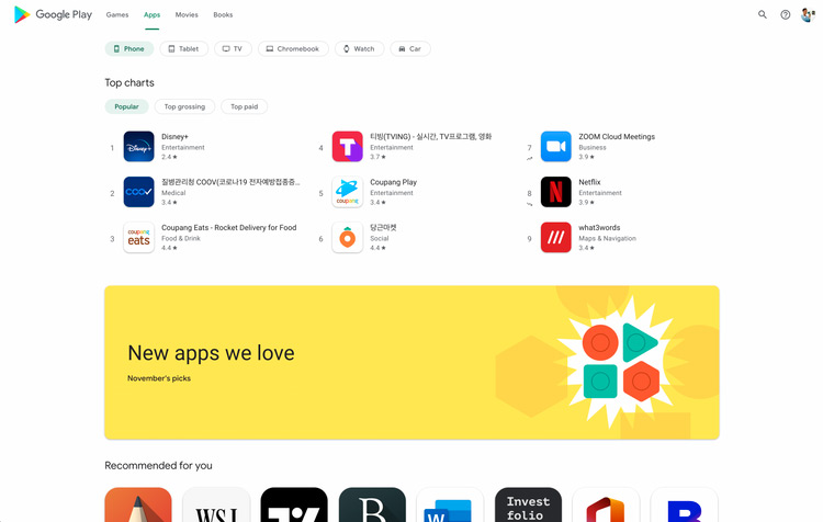
At the top of the screen you have access to the different types of content. Think of games, apps, movies and books. The sidebar that we still find in the web version can therefore not be found in the new design. If you search for apps, you can, for example, filter on the device that is supported. Think of the Chromebook, the smartphone or the tablet. You can also search specifically for apps for your (Android) Auto or your smartwatch. Sorting is possible in the new web version of the Google Play Store.
If you click on your profile picture, you will have a settings menu there. Here you can find your subscriptions, payment methods, your wish list and other useful functions.
We now have to wait and see when Google rolls out the new design for the web version of the Google Play Store. We haven’t seen him here yet.