Google Maps is testing a new, more clumsy route planner in Android app
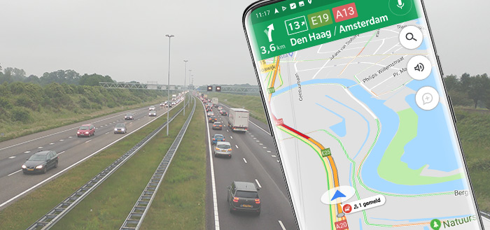
Google Maps has been easy to operate for many years. You choose your starting point, your destination and you immediately choose your means of transport. Google is now testing a different display and operation, and it looks more cumbersome.
Cumbersome operation of Google Maps
Some apps are indispensable for many. Google Maps is one such app. Where would we be without this handy map service and navigation app. Now Google is testing a new way of operating in the Google Maps Android app. At first sight it seems to be a lot easier to plan a route, but it is actually a lot less intuitive.
In the test, the well-known white block with text input fields at the top of the screen makes way for a floating window with two input fields. You choose your destination and your starting point. The main absent function here is choosing the means of transport. In the test version you will see the options for this at the bottom of the screen. You have quick access to adjust the departure or arrival time and adapt the route to specific wishes. So you do not tap faster to adjust the mode of transport, but you have to scroll more and then tap.
At this point, Google appears to be tweaking the Maps Android app for the test on some users. You have no influence on this. It is unknown at this point whether the new view will be rolled out to everyone.
What do you think of the new design of the route planner?